
So much effort put into something that appeared on the printed page at only one by two inches!
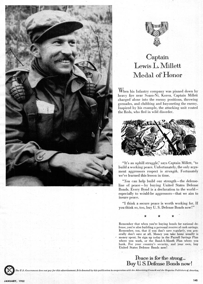
These tiny illustrations were part of the page design...
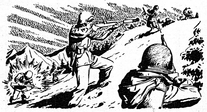
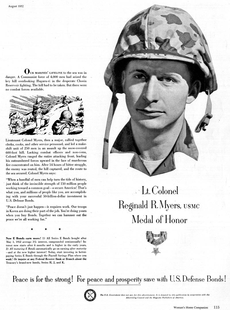
... of a series of U.S. Defense Bonds ads that ran in various mainstream magazines in 1952.
I can tell you from personal experience that, when viewed with the naked eye, the effort this talented but uncredited artist put into rendering these scens in such detail is impossible to really appreciate without a magnifying glass.

Thanks to our 21st century scanner technology...
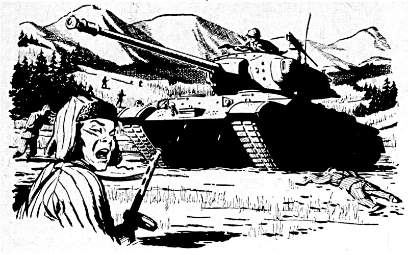
... we can enjoy them closer to the size at which they were probably created.
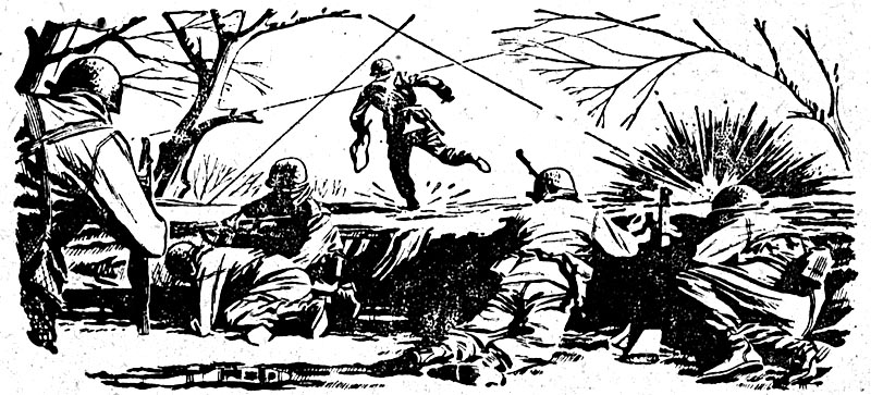
(Or even larger - click the images to go to my Flickr archives and see them twice up).


0 comments:
Post a Comment