Mike’s ambition was to break into the international illustration world, and a year later he went to London and worked for Carlton Artists, which was run on the lines of New York’s Cooper Studios. The company specialized in design, illustration and photography, and was the largest studio in Europe.
 (Above: Cover illustration for Four Square Books.)
 A year later he was introduced to Joan Farmer, who was setting up as an artists’ agent. She asked Mike if she could represent him.
 (Above: Illustration for a Sphere book cover with model Maggie Lorraine. The two illustrations above and the last one in yesterday's post have the same look about them as the illustrations Mike did for me at Woman’s Mirror. They had a nicely sculptured look as if he had picked up a chisel, instead of a paintbrush.)
 Joan introduced Mike’s work to all the leading magazines, and got him advertising commissions, one of which was working on the Kellogg account. The ubiquitous red London double-decker buses were covered with his paintings, attempting to entice the citizens of the capital to partake of Kellogg’s Sunshine Breakfasts.
 (Above: Book cover for Hodder and Stoughton. The model was Maggie Lorraine. Below: Another book cover for Hodder and Stoughton. The male model for this painting was our friend, the illustrator Renato Fratini.)
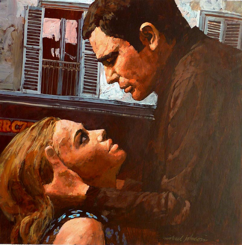
The same agency handled the Courtaulds account, and Mike was commissioned to illustrate a series of advertisements by the art director Willie Landels, who later became the editor of Harpers&Queen magazine.
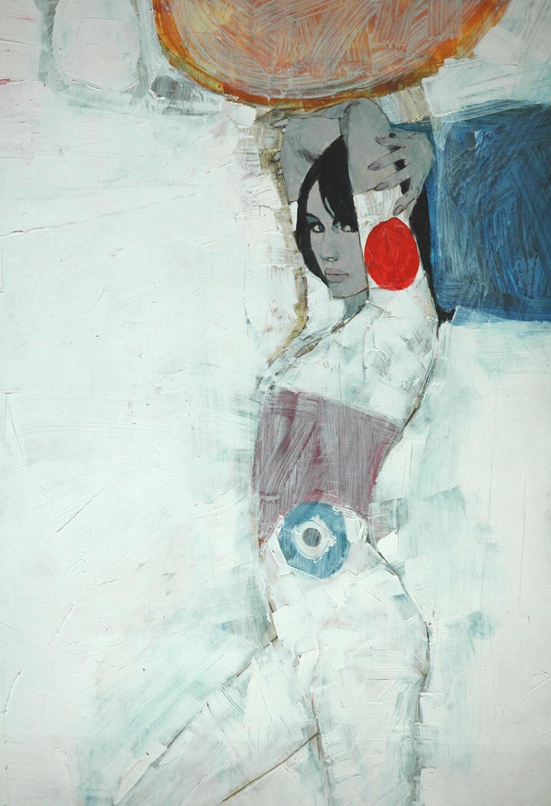 (Above and below: Three paintings that were shown to Willie Landels who was the editor and art director of Harpers & Queen magazine, but were never published.)
On the 31st of December 1959, we said goodbye to the austerity of the ’50s, and were suddenly in the “Swinging Sixties”, at least in London, which saw the dawn of a new consumerism. It wasn’t long before the British Prime Minister, Mr Harold MacMillan, was telling us “You’ve never had it so good!”
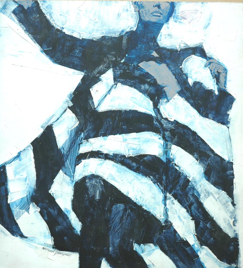
On the fashion front there were the French designers who had a huge influence on British design, including Courrèges and Givenchy with their geometric designs, and Eves Saint Laurent with his “Mondrian” day dress, produced in the autumn of 1965. In London, Mary Quant was blazing a trail on the fashion front, and Vidal Sassoon designed hairstyles to reflect and compliment the fashions with his geometric haircuts.
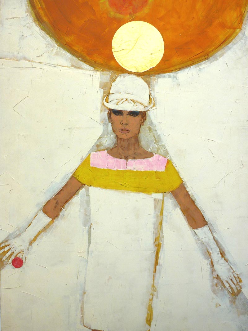
Mike liked acrylic as he worked very quickly. He was able to put down solid colour, and then scumble other colour on top as it didn't lift off the underpainting. He would also use oil paint if he wanted extra subtlety that couldn't be achieved with acrylic, and acrylic provides a good ground for oil paint.
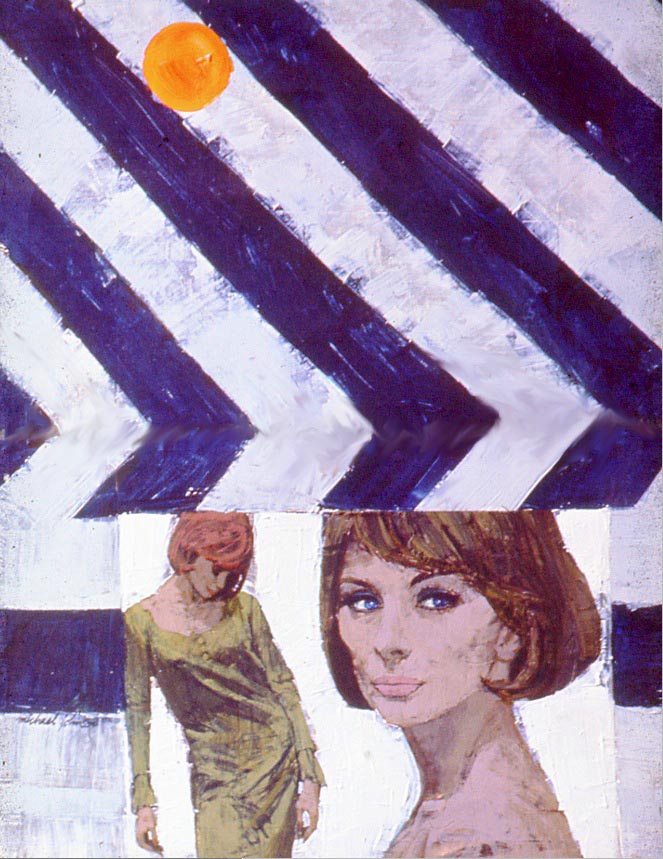 (Above: Although a successful illustrator, Mike, together with his peers, produced sample illustrations to develop his technique, and experiment with different concepts.)
I thought that Mike’s work epitomized the times more than any other illustrator, and it never ceased to excite me.
Continued tomorrow
* Bryn Havord was assistant art director of Woman magazine in the late '50s and early '60s. From 1963 to 1965 he was associate editor and art director of Woman's Mirror; both of which were published in the UK. During that time he commissioned work from all the leading British Illustrators including Michael Johnson, Brian Sanders, Walter Wyles, Eric Ernshaw and Gerry Fancett.


0 comments:
Post a Comment