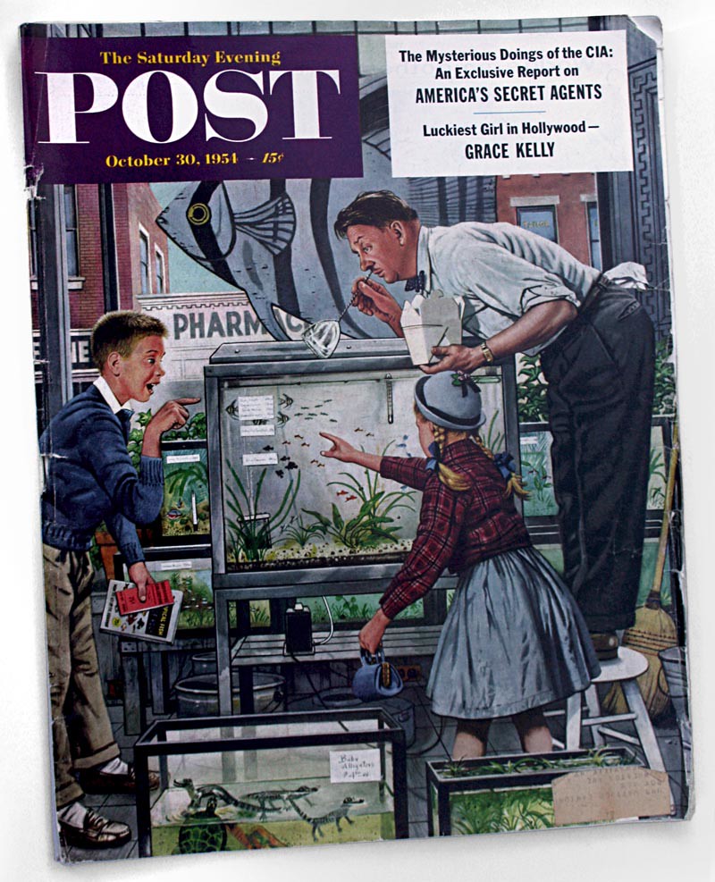
Ten years later, this typical 1964 issue of the Post has gone on a diet. Instead of 170 pages, it weighs in at only 92. The total count of all types of illustrations: 10.
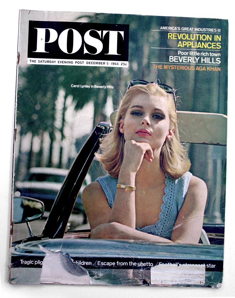
Extrapolate this change in illustration usage across all magazine publishing and it becomes easy (and alarming) to see that employment opportunities for magazine illustrators plummeted over the course of a decade. It might even be fair to describe the decline as "catastrophic."
In the '50s, advertising clients (who provided the best paying work for illustrators) sought out well known illustration mainstays like Edwin Georgi (below, right) featuring their work in major national print campaigns. Smaller market, anonymous 'journeyman' illustrators could make a decent living providing illustrations in a variety of styles for clients who purchased small-space ads, like the ones on the LH page, over many pages in the back of consumer magazines like the Post.
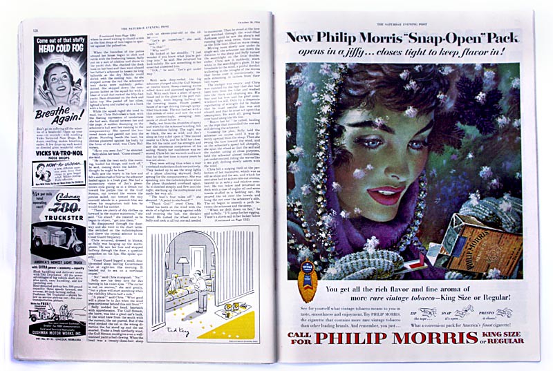
Ten years later, very few major ad campaigns were using illustration ... and small space ads had all but disappeared from the Post's pages.
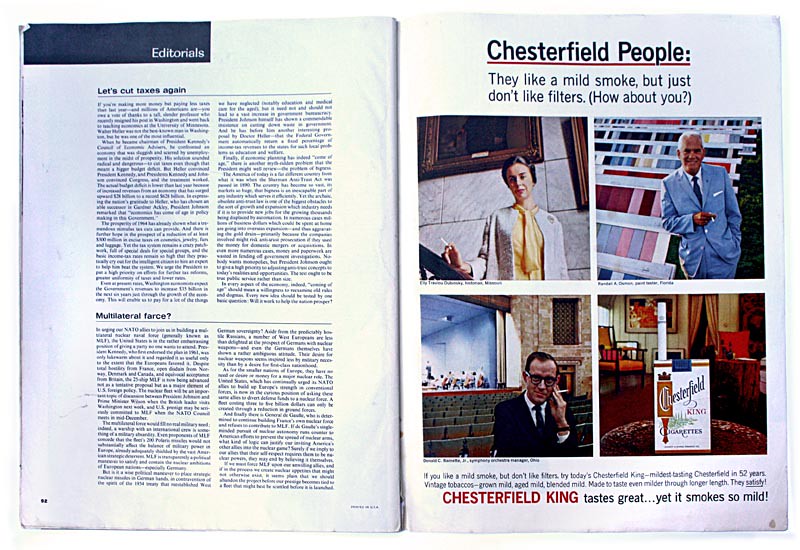
Rubbing salt in the wound was the change in page design.
In 1954 (and during most of the '50s) multiple double page spreads featuring gorgeous artwork by the likes of Joe DeMers, Coby Whitmore, Joe Bowler and others were a common weekly feature in the Post, Ladies Home Journal, Collier's, Good Housekeeping, etc.
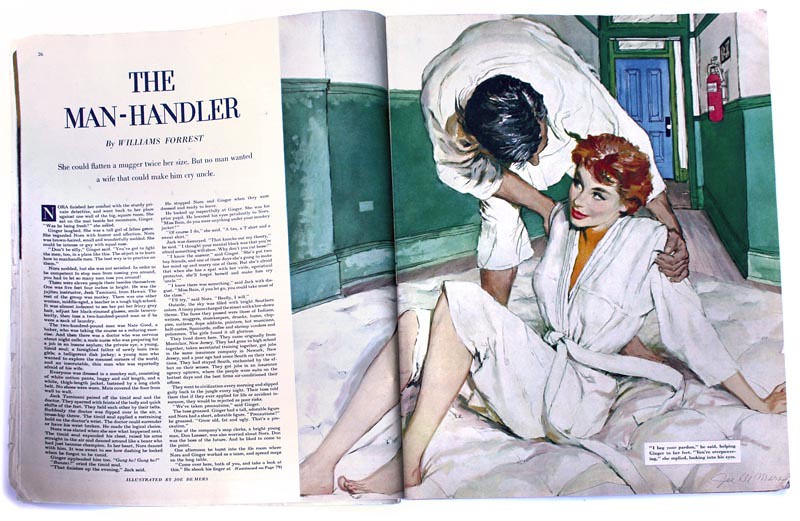
By 1957 Collier's was gone - along with a raft of other magazines - and by the early 1960s the Post (and many other magazines) had redesigned their page layouts in a way that didn't often allow for lavish displays of illustration... of any kind.
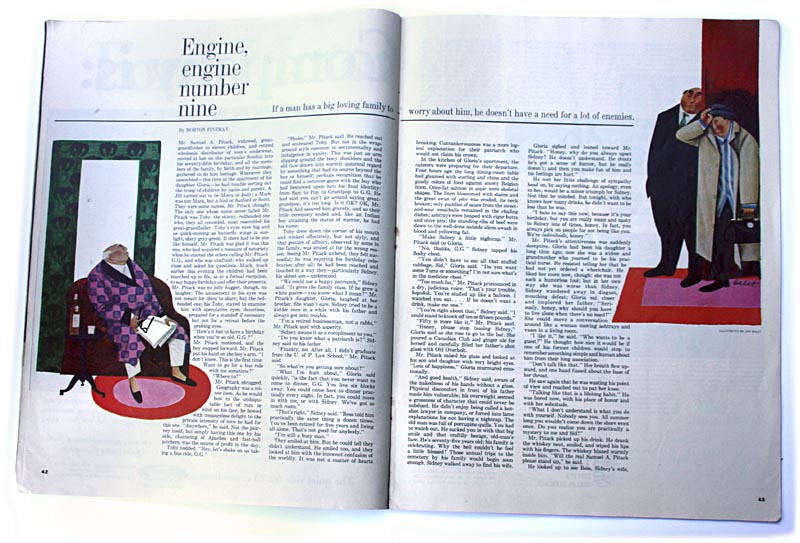
Illustration (when present at all) was more typically relegated to isolated islands of colour in a sea of white space and separated by multiple columns of type.
Interestingly, this particular 1964 issue of the Post features artwork by Jan Balet - a veteran Collier's illustrator who could never manage to get his work in The Saturday Evening Post during the '50s.
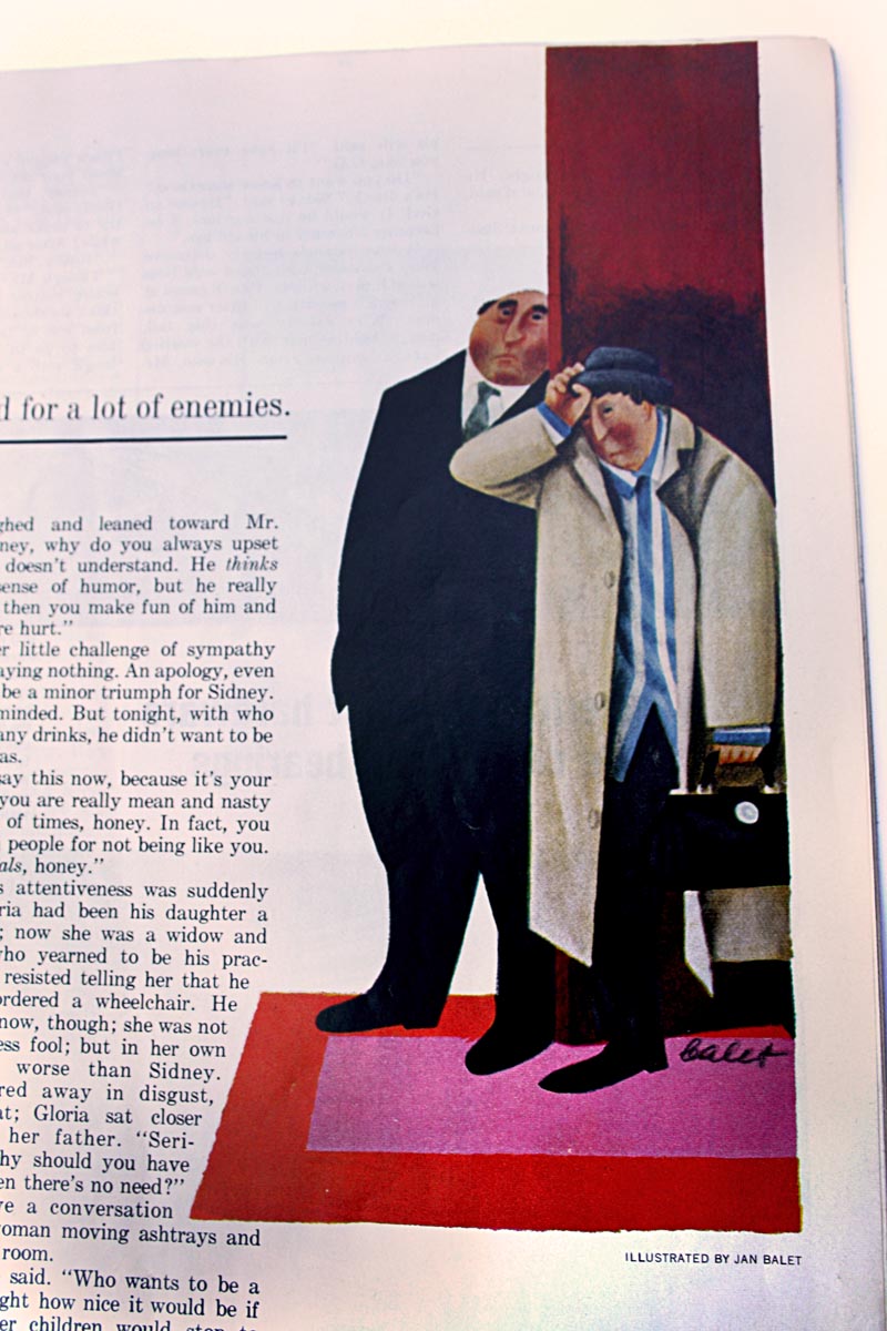
Like many other prominent mid-century illustrators, Balet must have seen that times were changing. Even the occasional assignment like this one could not sustain a career built on the 1950s illustration economy model. Many illustrators found refuge from the shifting fortunes of the magazine industry by refocusing his energies on establishing a presence in the fine arts market.
Jan Balet moved to Europe and successfully produced paintings, limited edition prints and lithographs for the remainder of his career.
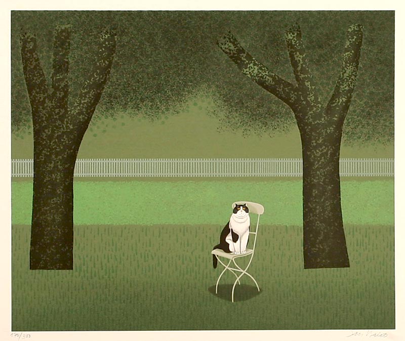
Close friends and former Cooper Studio artist associates, Joe Bowler, Joe DeMers and Coby Whitmore all moved to Hilton Head Island, where they also pursued fine arts opportunities.
Joe Bowler, the youngest of the trio, became a renowned portrait painter. A series of illustrations of fashions for young girls (one example below), which Bowler did for McCall's in 1960, was pivotal in the transition. Its publication brought Bowler his first requests to paint the portraits of children of prominent families.
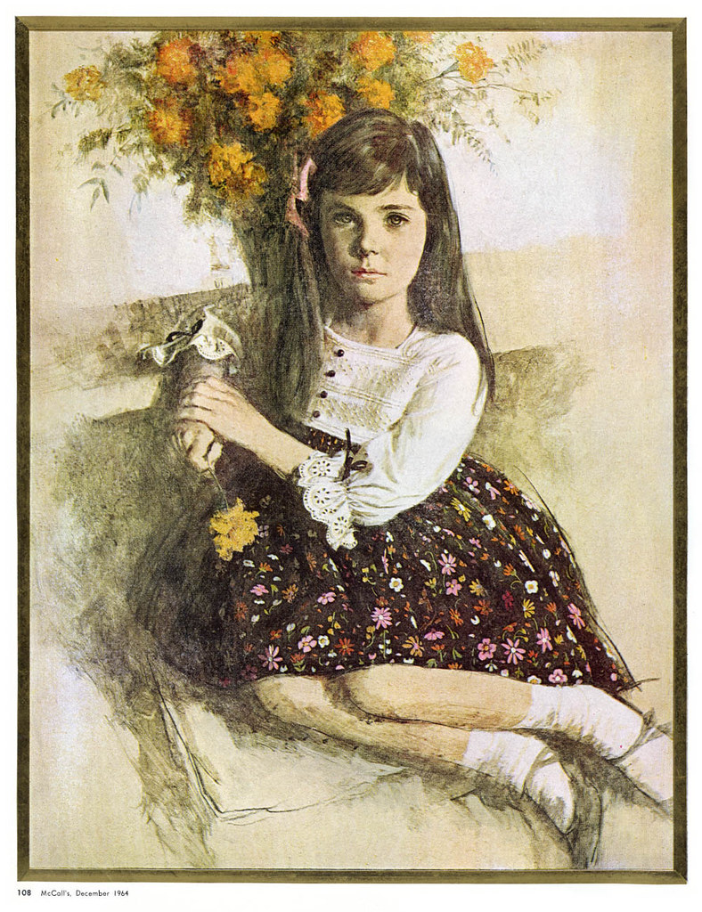
Bowler continued painting and showing new work - even as recently as March of this year. His fine art paintings can be see on his website.
There was also an exodus of illustrators to the South West - where many became well established ( and well compensated ) painters of 'western art.'
Don Crowley, another Cooper Studio alumnus told me, "[An old friend] visited me in Connecticut. He was opening a gallery in Tucson featuring western art... and that sounded kind of intriguing. So I sent out a couple of paintings and he sold one. And it really sounded like it might be a new direction for me."

There are too many more examples to list here - but suffice it to say, there are many. In his autobiography, "My Adventures as an Illustrator," Norman Rockwell wrote, "It is rare to find an artist who is successful at one and the same time in commercial and fine art."
At a time when many under-employed illustrators needed an exit strategy, transitioning to fine art after doing commercial art proved to be very successful.
* This evening from 7 to 9 pm I'll be in Toronto at The Nook giving a talk about mid-century illustrators whom I've written about over the last six years. I'll share stories and anecdotes - some from my research but also many from personal interviews I've conducted with many Canadian and American illustrators of the mid-20th century. I'll be looking at changing styles and technology and how both have impacted the business of illustration over the last half century. Perhaps we can learn something from the lessons of the past... or perhaps we are doomed to repeat it.
Also, there will be treats.
If you think you might like to attend, the details are at The Nook Collective website


0 comments:
Post a Comment