InspirationWhodunnit

  • Subscribe to our RSS feed.
  • Twitter
  • StumbleUpon
  • Reddit
  • Facebook
  • Digg

Friday, 26 February 2010

Harry Beckhoff: An Illustrator You Should Know

Posted on 06:50 by Unknown
I was going to show some work by David Grove today, but when Howard Chaykin leaves a comment and asks for Harry Beckhoff, what choice do I have? I've been following this guy since I first read Cody Starbuck at age 14 in an old 'ground-level' comic called Star*Reach. But back to Beckhoff. Howard is absolutely correct that he is an illustrator you should know.


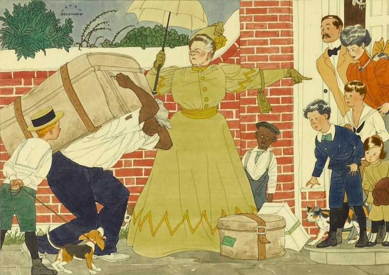
Above, a Beckhoff illustration from a 1936 Collier's magazine, courtesy of Heritage Auctions. Just seven years earlier Beckhoff had his first magazine illustration published in The Country Gentleman. His style was so entirely appropriate for the times, wasn't it?

Not surprisingly, he soon began receiving commissions from all the major magazines, but was especially closely associated with Collier's.

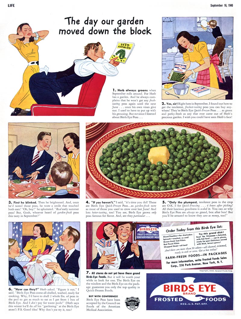
In the early 1940's Harry Beckhoff illustrated what must have been an extremely lucrative series of ads for Birds Eye frozen foods that regularly appeared in the front pages of Life magazine. Beckhoff had a unique approach to executing his work: he would do small but very accurate thumbnails ( that even included clearly defined facial expressions ) which he would blow up to about five times their original size...
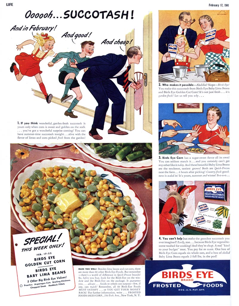

... and then ink in their outlines. He then added tone and colour with flat washes.
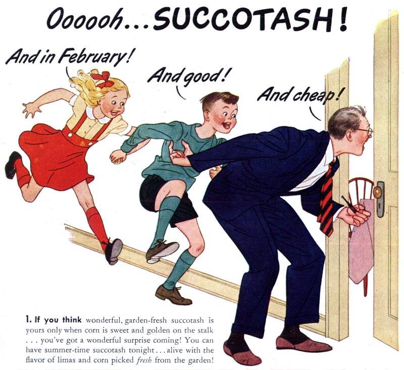

This may have been a time saving measure on Beckhoff's part, working from blown-up thumbnails instead of having to execute a complete full-sized pencil drawing, but I suspect it was more about capturing the energy and gestural qualities in that original thumbnail sketch...
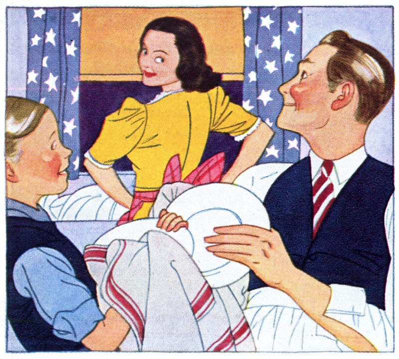

... something that many artists feel is lost when a first rough is refined over and over.

I've loved Harry Beckhoff's work since the moment I first saw it, but what has always fascinated me is how his style never seemed to change or advance or evolve with the times. It looked like it came from (and belonged in) the 1930s and even as other illustrators adapted their styles to changing trends, Harry Beckhoff's style remained firmly entrenched in the '30s. Here's another piece from Heritage Auctions, from Collier's, 1950.

Then, much to my surprise, I discovered this 1956 story in Cosmopolitan magazine, illustrated by Harry Beckhoff. This was really exciting. Here was Harry Beckhoff art looking really contemporary for the times!
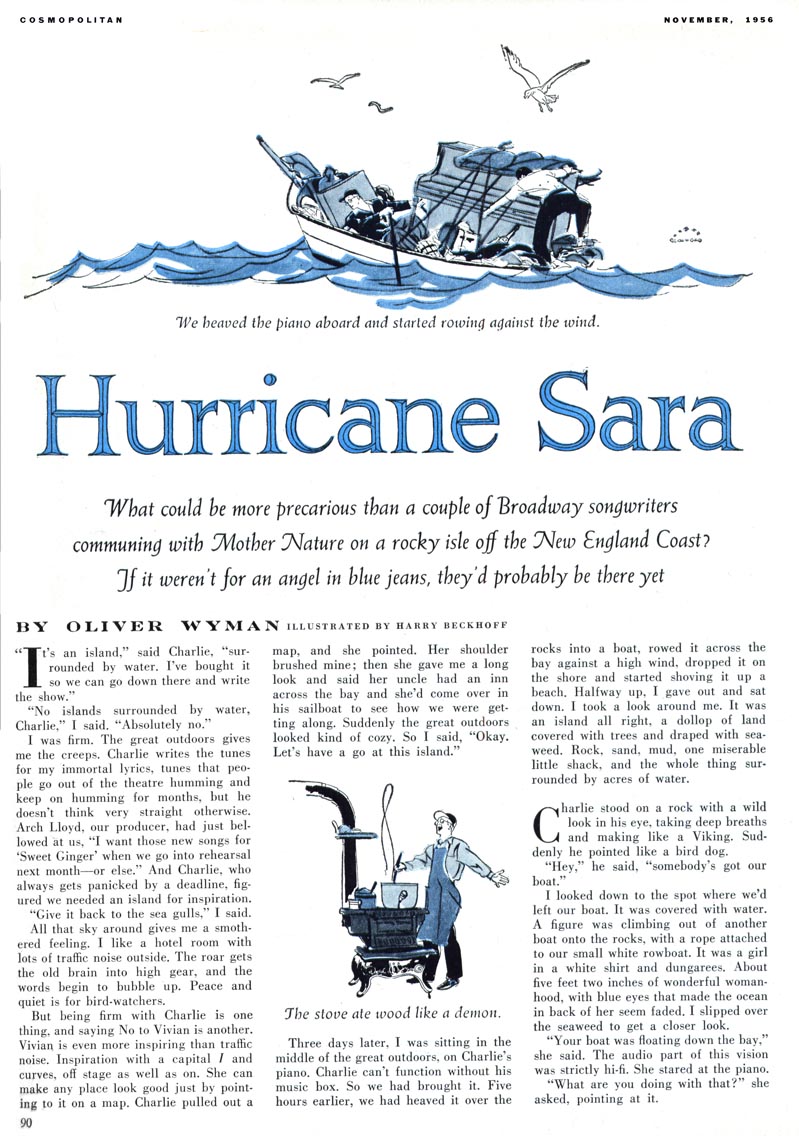

I've written before in praise of Cosmo AD, Robert C. Atherton. Was he the one who encouraged Beckhoff to push the envelope?


Or was Beckhoff finding it harder to land enough work because his style was, perhaps, simply not modern enough for most clients' wishes?
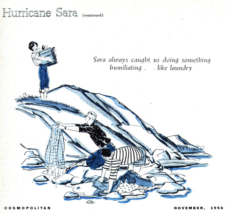

Whatever the case may be, this series from 1956 stands, for now, as the only one I've seen where Harry Beckhoff art didn't look like the typical Harry Beckhoff art.
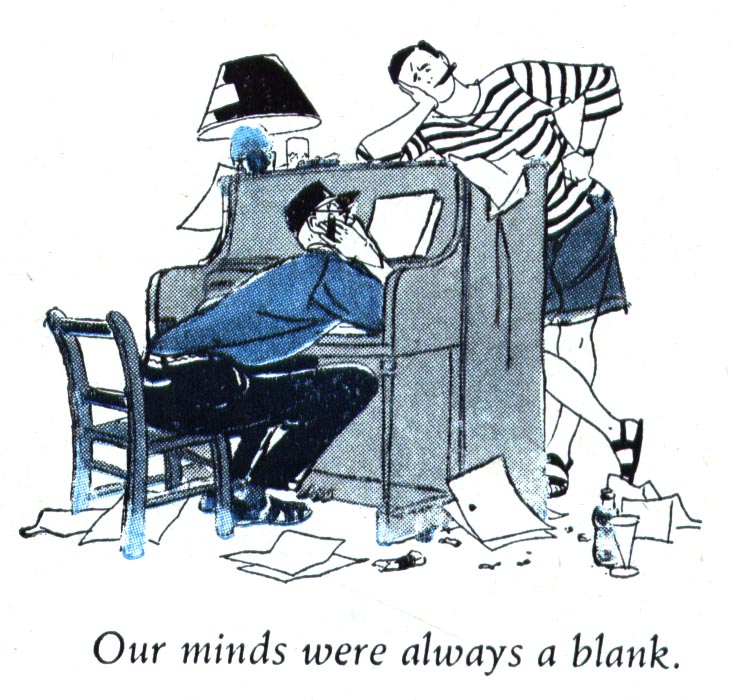
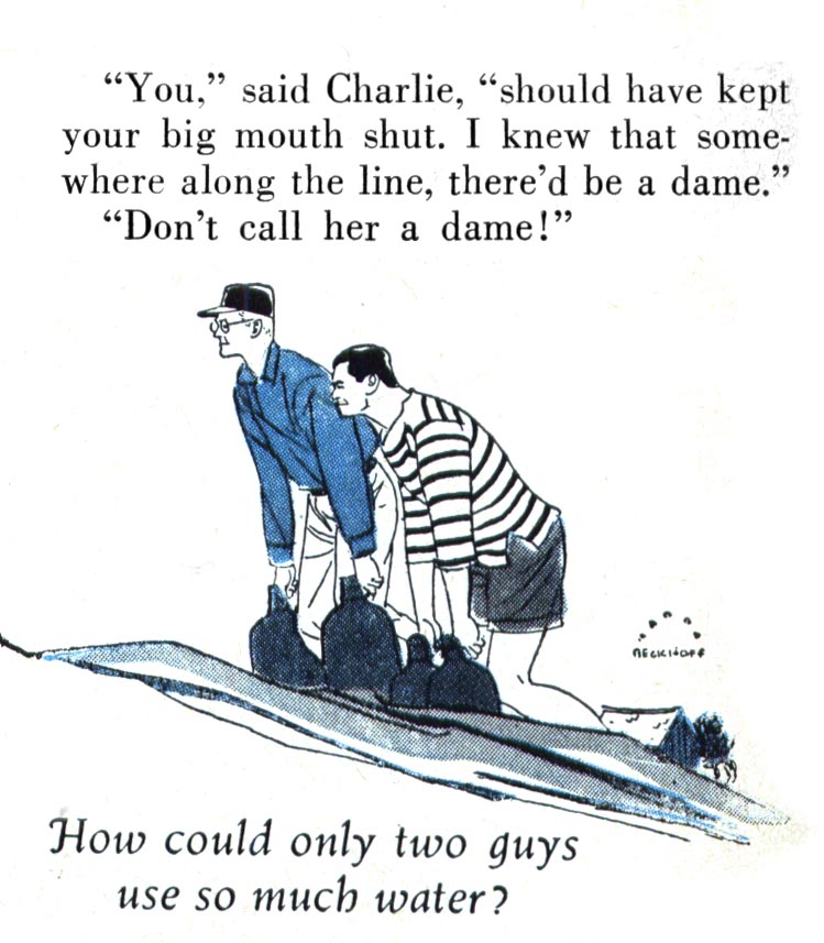

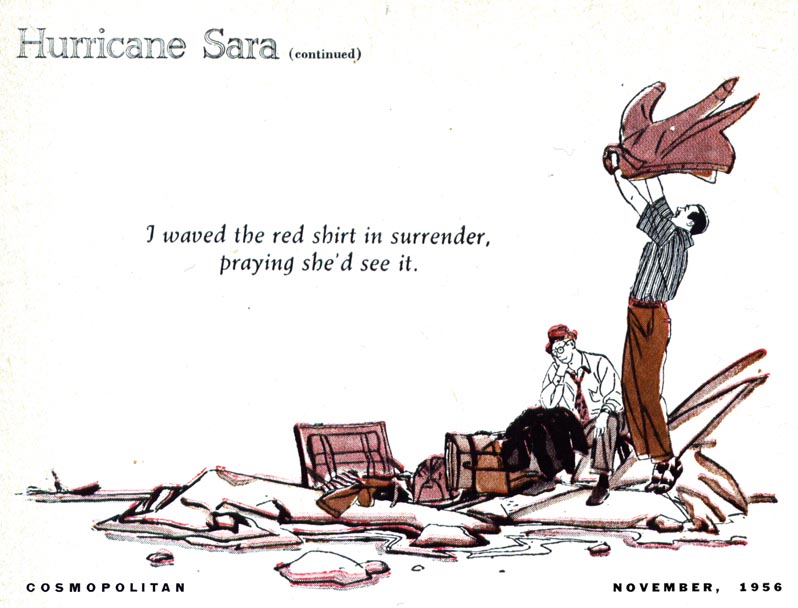
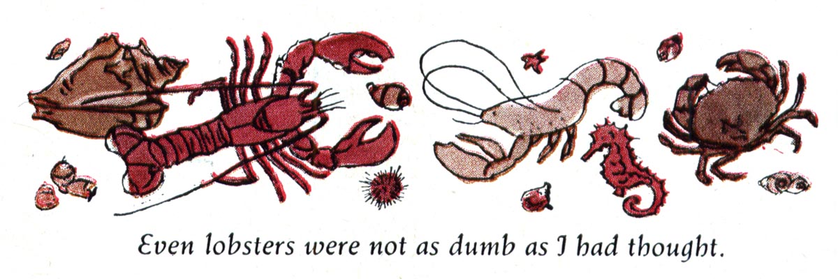

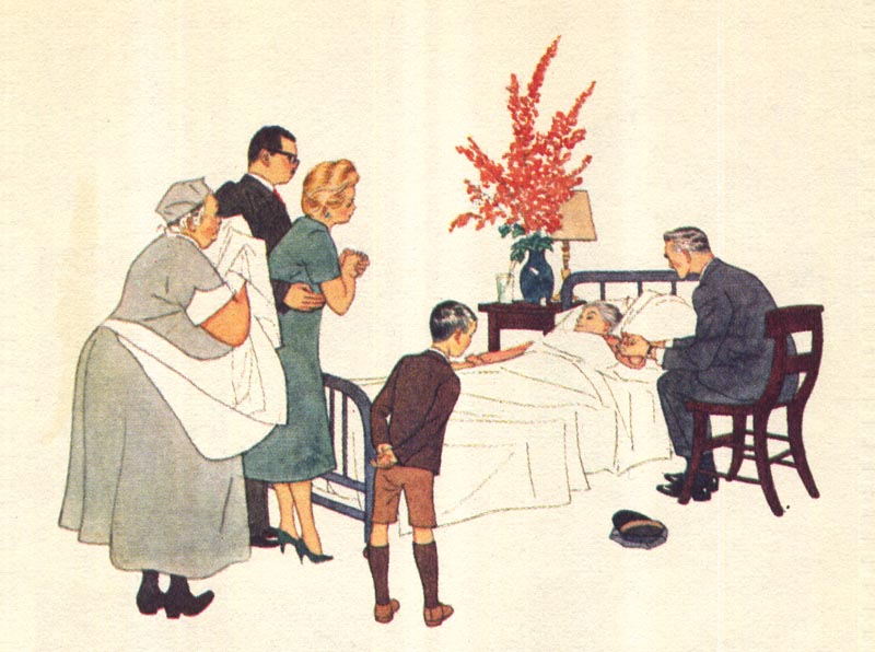
And who knows? Maybe its just best to stick with what you're good at. By 1960 Harry Beckhoff was back doing his thing, this time for Reader's Digest Condensed Books. Although the reproduction quality on the cheap paper used by RDCB doesn't do Beckhoff's delicate line work and attractive colour schemes justice...
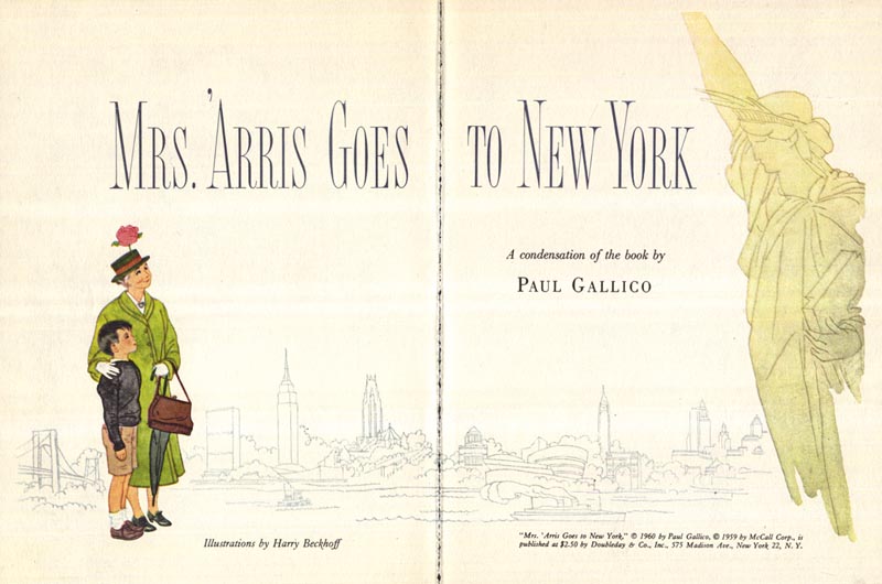

... this series from the then 60 year old illustrator is as lovely as anything he had ever done before.


Still, consider the work we've looked at so far... consider that the Cooper studio had come and gone... consider that Bernie Fuchs and Bob Peak where reinventing the look of mainstream illustration... and then look at what Beckhoff was still doing.


Of course the quality of the work is admirable...
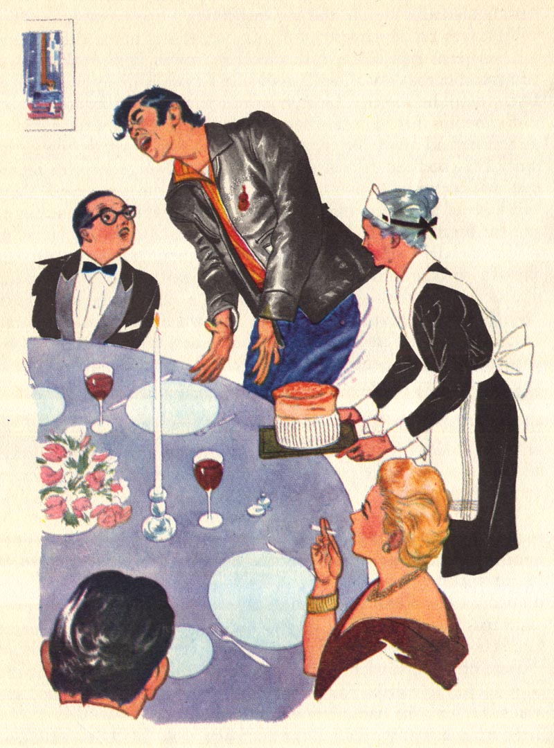

Beckhoff's abilities unquestionable...


... but the word that comes to my mind is "quaint."

The latest piece by Harry Beckhoff I've ever found: from the 1963 book, Reader's Digest Treasury for Young Readers. By coincidence, Beckhoff was assigned to illustrate a story originally published in 1936 - the year he illustrated the Collier's piece at the top of this post. I don't doubt that the editors felt he would be perfect for this article because his style, like the story itself, was so dated.
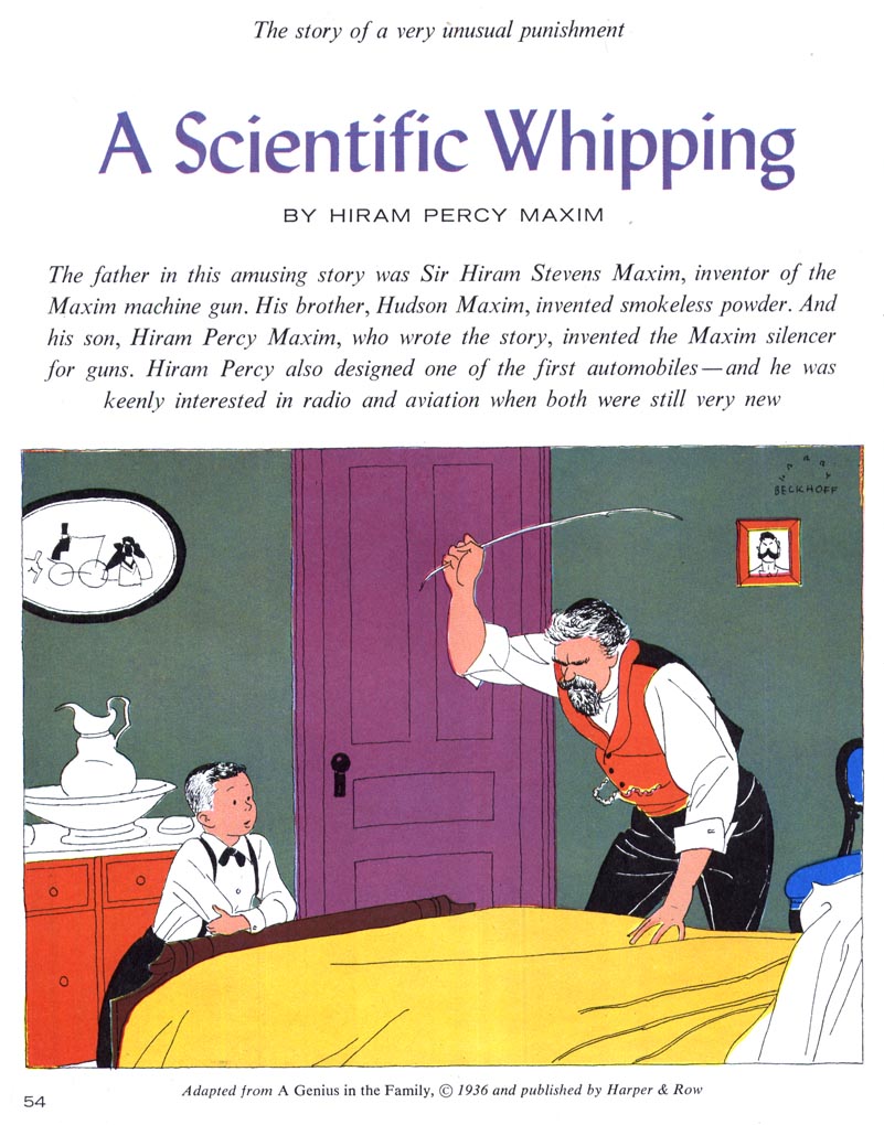

Sometimes, if you stick to your guns long enough, you outgrow being considered "dated" and become a "specialist" - that rare commodity that is highly prized for having the expertise to do a certain thing better than almost anybody else. Let's hope that was the case for Harry Beckhoff, a wonderful illustrator you should definitely know.

* My Harry Beckhoff Flickr set.
Email ThisBlogThis!Share to XShare to FacebookShare to Pinterest
Posted in | No comments
Newer Post Older Post Home

0 comments:

Post a Comment

Subscribe to: Post Comments (Atom)

Popular Posts

  • Bruce Johnson, Canadian Illustrator
    Here's a wonderful early '60s illustration by Canadian illustrator Bruce Johnson. Unfortunately, there isn't a lot of informatio...
  • Leon Gregori: "... he would draw and draw and draw."
    There are some illustrators of the mid-century whose work I have come across time and again in my collection of old magazines about whom the...
  • Lowell Hess: "I had a reputation as an artist with talent."
    "As I grew up," writes Lowell Hess the introduction to his new book , "it was my only interest to make pictures." And p...
  • Good-bye Mitchell Hooks (1923 - 2013)
    A couple of days ago on Facebook, Dan Zimmer of Illustration Magazine shared some sad news: last weekend, Mitchell Hooks passed away. How p...
  • Model Kit Box Art by "the Two Roys"
    By Guest Author, Roger O'Reilly For anyone growing up in Britain or Ireland in the 70's and 80's who had half an interest in bui...
  • Michael Johnson: "I looked forward to being surprised, and always delighted, with what he produced."
    Guest author Bryn Havord introduces the early work of English illustrator Michael Johnson, covering the decade of his work, from the end of...
  • The Art of Summer Reading: Mercer Mayer
    Among all the beloved, memorable books of my childhood, I probably hold no other series in higher esteem than I do John D. Fitzgerald's ...
  • Barbara Bradley: A Female Illustrator You Should Know
    Last week I received, once again, a comment from a reader asking "what about the female illustrators of the mid-20th century?" Th...
  • The Art of Summer Reading: Robert McCloskey
    I wonder if anyone else remembers the terrific "Henry Reed" series of chapter books, illustrated by Robert McCloskey. I've me...
  • Howard Terpning, Magazine Illustrator
    Today most people think of Howard Terpning as one of America's premier western art painters. Terpning's prints and paintings can be...

Blog Archive

  • ►  2013 (68)
    • ►  August (3)
    • ►  July (4)
    • ►  June (12)
    • ►  May (4)
    • ►  April (6)
    • ►  March (10)
    • ►  February (16)
    • ►  January (13)
  • ►  2012 (127)
    • ►  December (3)
    • ►  November (2)
    • ►  October (10)
    • ►  September (8)
    • ►  August (10)
    • ►  July (17)
    • ►  June (20)
    • ►  May (14)
    • ►  April (3)
    • ►  March (13)
    • ►  February (15)
    • ►  January (12)
  • ►  2011 (146)
    • ►  December (17)
    • ►  November (11)
    • ►  October (9)
    • ►  September (16)
    • ►  August (15)
    • ►  July (5)
    • ►  June (9)
    • ►  May (11)
    • ►  April (15)
    • ►  March (10)
    • ►  February (16)
    • ►  January (12)
  • ▼  2010 (159)
    • ►  December (10)
    • ►  November (18)
    • ►  October (11)
    • ►  September (9)
    • ►  August (23)
    • ►  July (15)
    • ►  June (12)
    • ►  May (15)
    • ►  April (17)
    • ►  March (21)
    • ▼  February (8)
      • Leif Peng: An Illustrator You Should Know?
      • Harry Beckhoff: An Illustrator You Should Know
      • Bob Abbett: An Illustrator You Should Know
      • Ted CoConis: An Illustrator You Should Know
      • David Blossom: An Illustrator You Should Know
      • Bob Foster: "... a gentleman (with) personal high...
      • Bob Foster: :... he dramatically opened doors tha...
      • Bob Foster: "When drawing... we need to tell the ...
Powered by Blogger.

About Me

Unknown
View my complete profile