


Bob would discuss various compositions, poses and gestures with the class, explaining the best approach for a given scene. He would discourage us from trying to draw figures or props out of our heads, insisting they needed to look believable. He did not allow tracing or projecting the photo or paper and tracing it. He wanted us to learn first to draw correct proportions, so we could intelligently interpret the model.

The photos were all in black and white, and he would provide large prints, 11”x14”, and occasionally larger, for a nominal fee. He wanted us to develop our own color and not be influenced by color from a color print, which wasn’t all that good back then, and much more expensive. Bob would really get excited about the possibilities of each scene he set up and directed. He would move the light around until it was exactly the way he wanted, discussing and explaining how the lighting set the mood and helped define the plains in the face and body. Sometimes he would look for interesting shadow patterns that clearly defined the form in the head.

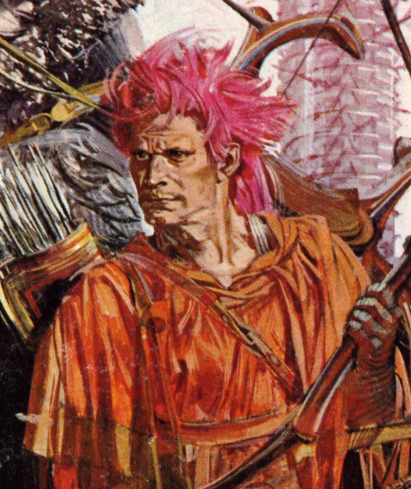
He would explain that every shape had to flow and tie together as one big unit. For some scenes, the lighting was purposely flat with no shadows, etc., for a more decorative technique, such as a combination of line and color washes. Then he would show us examples, pulling out perhaps an editorial illustration by Robert Fawcett or Joe DeMers, or an ad illustration by Bob Peak or maybe Jack Potter. He discussed correcting the lens distortion when drawing from photos. He would say, ‘What we see in a photo is often a lie, and when drawing the human form, we need to tell the truth.’
It was a big thrill for us, when Bob brought in examples of his work. The first examples I saw, were in gouache. I remember one in particular that was a head and torso painting of Grace Kelley, who he considered one of the most beautiful women in the world, along with a very popular and famous 50’s N.Y. model, Susie Parker. His paintings were accurately drawn and skillfully rendered, working semi transparent gouache wet into wet. He used a combination of soft and hard edges, applying thicker applications of paint for the highlights. Bob always used the finest flat and round red sable brushes, and treated them like a $50,000 mink coat. He would stress buying the best tools and equipment we could afford, and to always take special care of them. He believed that an illustration depended as much on the quality and condition of our brushes, as our knowledge and skill in doing an illustration.

He mixed his colors on a white porcelain butcher’s tray, and had us do the same. He would discourage us from using gimmicks or special tools to create special effects, until we were experienced in traditional painting methods first. When he wanted to soften an edge in gouache, he used his brush and painted wet into wet, or feathered dry paint using clear water, and when using oil paint, he used his finger or thumb to blend the edges, or soften an edge. He recommended Whatman Illustration board (a top quality cold press board used by most of the top illustrators) because it had a high quality surface that could take abuse, like flooding passages and wiping out unwanted paint, etc.
Struggling to achieve a higher skill level than our lack of experience would allow, we would often over work a head, then wash it out and redo it. However, Bob would tell us it was better to start over and redo the whole illustration, than to waste time trying to save it. He would explain that as students, we had the time and the responsibility to ourselves to make the added effort, while learning. I admit, I proved him right on more than one occasion. It was rare that I could get away with taking out a whole head, after completing half or more of the illustration, and try to redo do it so that it was as fresh looking as the rest of the painting. It was one of my most frustrating challenges as a student.
Bob taught another class called, ‘Painting From The Clothed Model’. We painted from a live model in oils on canvas, which I particularly enjoyed. One time we had an elegant stylish woman wearing a fashionable print dress in a graceful pose, using a stool as a prop. Bob would comment, ‘Give her that long leggy look.’ The next time it would be a beautiful ballerina sitting in her dance costume, with a palm plant and a dress form as props. For another interesting pose, I recall an elderly gentleman, who was an actor and professional model. He had a stylish white mustache, a bowler hat, a cane and was wearing a dark three piece suite, sitting in a large high back chair.
Bob would usually light the scenes in a theatrical manor, as if it were stage lighting. Recently, I found out from his niece and younger brother, that his mother was a Ziegfield Follies dancer when she was young, and his father was a professional photographer. That really wasn’t a surprise to me, because I could tell it was in his blood.
Continued tomorrow.
* Tom Watson is a retired West Coast illustrator, art director and educator. He has been a frequent contributor to Today's Inspiration and his storyboard work for film was a subject of a post on my other blog, Storyboard Central.
* Many thanks to Kyle Katz for allowing me to use the Bob Foster paperback cover scans above. The original art scan is courtesy of Heritage Auctions.


0 comments:
Post a Comment