By Tom Watson Part 4
Bob took us on class field trips to the Palace of the Legion of Honor Museum, and the DeYoung Museum in San Francisco, as well as the city zoo to sketch. The DeYoung Museum was having a major traveling show of Vincent Van Gogh paintings, so Bob planned a class trip to see the show. Van Gogh was not one of his favorite painters, as his technique was too crude and primitive for Bob’s more literal taste, but he knew the value of perhaps a once in a lifetime opportunity to see his original paintings and learn what we could from the opportunity.

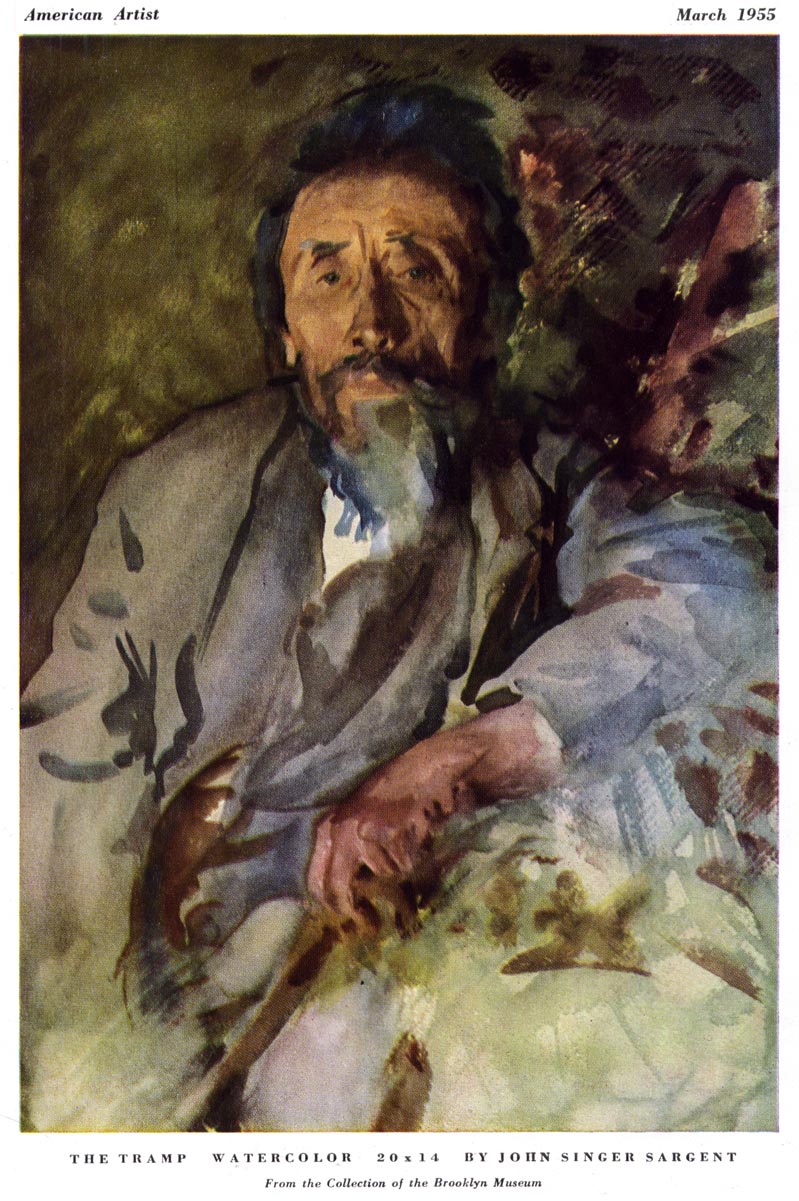
Exposure to the masters was part of Bob’s belief system for ongoing self education. He was very aware of the influence that past masters had on the great illustrators, and encouraged us to study their work. He would tell us to first go to the museums if possible, or look and study their reproductions in books. Visiting museums became a life long experience for me, and continues to inspire my soul. He particularly liked the paintings of John Singer Sargent, Giovanni Boldini, Anders Zorn, Robert Henri and Edgar Degas. He felt that Sargent’s drawing and painting skills were extraordinary, and superior to most of the top painters of his day.
He loved Degas ballerina’s, and his unusual compositions and cropping of the figures. In that respect Bob was more than just another teacher for me, he dramatically opened doors that I didn’t even know existed. Bob’s enthusiasm was truly contagious. If you couldn’t get excited about being an illustrator in Bob’s classes, you were studying for the wrong profession.
After I left the Academy of Art in 1960, I lost contact with Bob until 1968. He had left the Academy soon after I did, and moved to the East Coast, where he taught for a while at the Famous Artists School Correspondence Course in Connecticut. That gave him time to finish building his portfolio and then break into the N.Y. illustration market. In 1968 I was working for a studio in Chicago and had to take a business trip to N.Y. I called Bob in Manhattan, where he was living, and we made plans to have lunch together. He was living in a comfortable brownstone apartment that functioned as a studio and darkroom but it looked more like a studio and dark room that also functioned as an apartment. His original intent was to break into the magazine illustration field, where the spotlight of modern illustration had been centered throughout the 1950s, but that market was starting to shrivel and gave less opportunity for the new guy in town. So he found a lucrative niche illustrating mostly pocket book covers for the major publishers and had built a substantial reputation, particularly in the science fiction market.
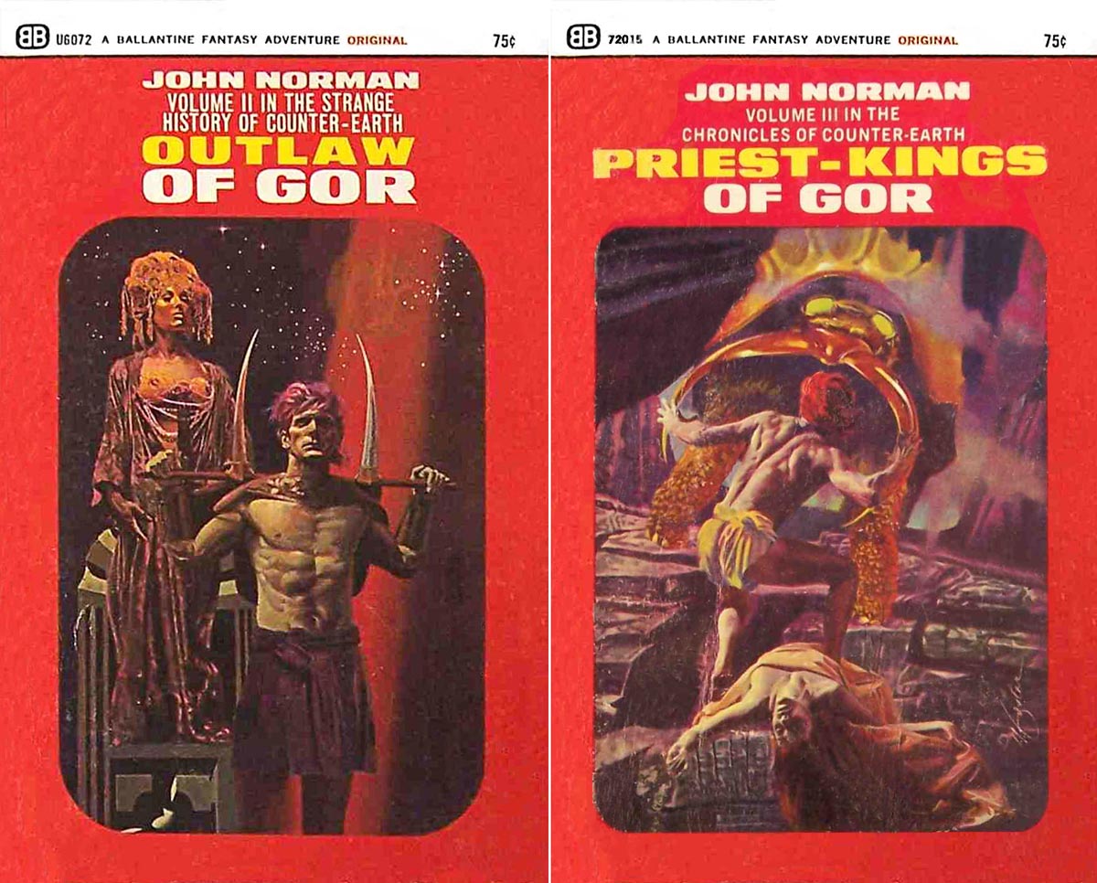
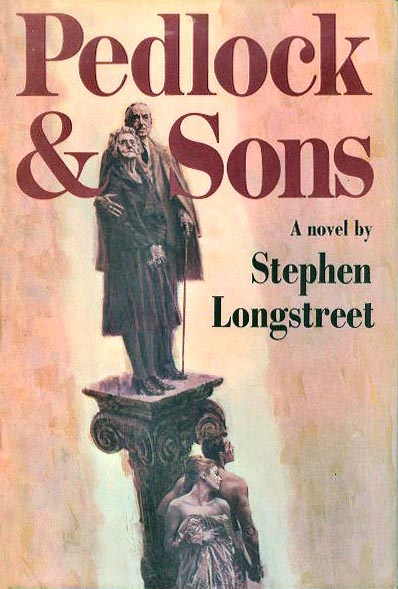
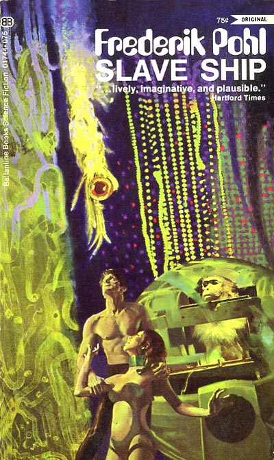
Fredrick Pohl was a well known sci-fi writer at the time and Bob did many illustrations for the covers of his books. One of his crowning achievements was a series of the first four covers for John Norman’s famous (sci-fi) ‘Gor’ series. He illustrated the covers for other well known writers of the day, such as Doris Lessing, Paul Callico (Poseidon Adventure) and Somerset Maugham, to name a few.
Bob would start a painting with a loose monotone transparent acrylic ground wash on illustration board, and then render the illustration in oil over the acrylic wash. His careful understanding of values and skill in knowing where to soften edges and where to show hard edges, created a sense of reality beyond photo realism.
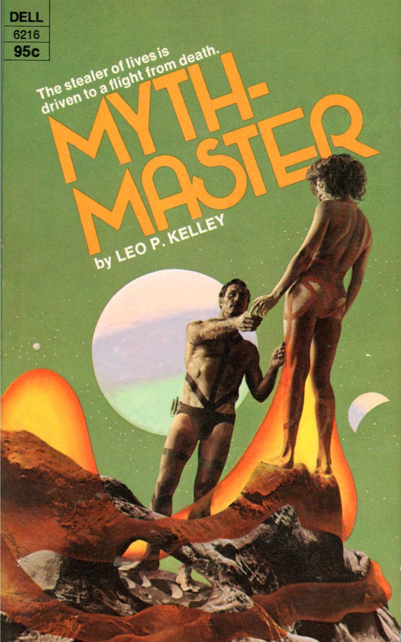
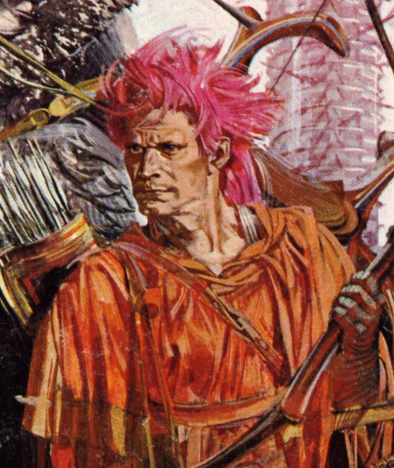
Depending on the subject, his illustrations varied in their degree of realism, and some were rendered quite painterly. He was one of the very few successful sci-fi illustrators who used a unique surrealistic technique, ideal for that market. He used his anatomical knowledge to depict and render accurate human form, and blended innovative elements and backgrounds reminiscent of surrealism in a dramatic theatrical setting. Bob’s illustrations were carefully designed, positioning his figures and props to visually flow together, and to contrast and compliment each other. In several examples, he extracted shapes and forms from small watch parts, gears, wheels, etc., enlarging and altering them for unique background props.

One illustration example implies microscopic organisms as a bizarre, but convincing background.
In another example, he carefully designed and skillfully rendered wrinkled bed sheets, two pillows, and a single red rose on one. On one side of the bed, in a prone position, is a discreetly posed nude figure. The overhead view looking down from the ceiling, gives compelling visual drama. The entire illustration is bathed in soft amber tones.

In yet another example, he created a tightly knit composition, using his trademark dramatic theatrical staging. A man in knickers is casually posed next to a large antique standing mirror, depicting an elegant formal scene reflected in the mirror.

Against a white background, it gives visual clarity and high contrast. Again, the lighting is dramatic and strategically planned for a strong silhouetted design.
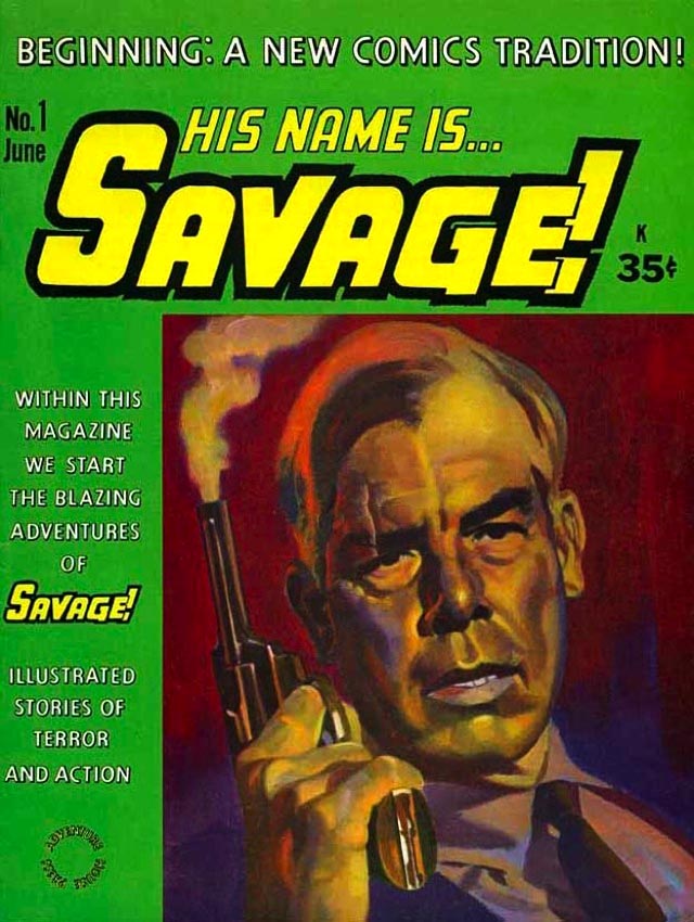
Bob also illustrated the cover for the first “Savage!” comic book series, based on a character resembling the actor Lee Marvin, which was rendered in a dramatic stylized, but literal technique.
He often chose his props as subtle “window dressing”, such as the example indicating a bottle of champagne, a wire cage and a red rose on a table top. All are complimenting textures and shapes. Only small parts of each prop shows, avoiding distraction from the two figures. I don’t recall for sure, but I think he also did some advertising illustration for agencies in N.Y. during the 1960s.
Continued tomorrow.
* Tom Watson is a retired West Coast illustrator, art director and educator. He has been a frequent contributor to Today's Inspiration and his storyboard work for film was a subject of a post on my other blog, Storyboard Central.
* Many thanks to Kyle Katz, gojira2012 and mystique123_2000 for allowing me to use the Bob Foster paperback cover scans above.
* Many thanks to Heritage Auctions for allowing me to use the original Bob Foster art scan seen above.
Bob took us on class field trips to the Palace of the Legion of Honor Museum, and the DeYoung Museum in San Francisco, as well as the city zoo to sketch. The DeYoung Museum was having a major traveling show of Vincent Van Gogh paintings, so Bob planned a class trip to see the show. Van Gogh was not one of his favorite painters, as his technique was too crude and primitive for Bob’s more literal taste, but he knew the value of perhaps a once in a lifetime opportunity to see his original paintings and learn what we could from the opportunity.
Exposure to the masters was part of Bob’s belief system for ongoing self education. He was very aware of the influence that past masters had on the great illustrators, and encouraged us to study their work. He would tell us to first go to the museums if possible, or look and study their reproductions in books. Visiting museums became a life long experience for me, and continues to inspire my soul. He particularly liked the paintings of John Singer Sargent, Giovanni Boldini, Anders Zorn, Robert Henri and Edgar Degas. He felt that Sargent’s drawing and painting skills were extraordinary, and superior to most of the top painters of his day.
He loved Degas ballerina’s, and his unusual compositions and cropping of the figures. In that respect Bob was more than just another teacher for me, he dramatically opened doors that I didn’t even know existed. Bob’s enthusiasm was truly contagious. If you couldn’t get excited about being an illustrator in Bob’s classes, you were studying for the wrong profession.
After I left the Academy of Art in 1960, I lost contact with Bob until 1968. He had left the Academy soon after I did, and moved to the East Coast, where he taught for a while at the Famous Artists School Correspondence Course in Connecticut. That gave him time to finish building his portfolio and then break into the N.Y. illustration market. In 1968 I was working for a studio in Chicago and had to take a business trip to N.Y. I called Bob in Manhattan, where he was living, and we made plans to have lunch together. He was living in a comfortable brownstone apartment that functioned as a studio and darkroom but it looked more like a studio and dark room that also functioned as an apartment. His original intent was to break into the magazine illustration field, where the spotlight of modern illustration had been centered throughout the 1950s, but that market was starting to shrivel and gave less opportunity for the new guy in town. So he found a lucrative niche illustrating mostly pocket book covers for the major publishers and had built a substantial reputation, particularly in the science fiction market.
Fredrick Pohl was a well known sci-fi writer at the time and Bob did many illustrations for the covers of his books. One of his crowning achievements was a series of the first four covers for John Norman’s famous (sci-fi) ‘Gor’ series. He illustrated the covers for other well known writers of the day, such as Doris Lessing, Paul Callico (Poseidon Adventure) and Somerset Maugham, to name a few.
Bob would start a painting with a loose monotone transparent acrylic ground wash on illustration board, and then render the illustration in oil over the acrylic wash. His careful understanding of values and skill in knowing where to soften edges and where to show hard edges, created a sense of reality beyond photo realism.
Depending on the subject, his illustrations varied in their degree of realism, and some were rendered quite painterly. He was one of the very few successful sci-fi illustrators who used a unique surrealistic technique, ideal for that market. He used his anatomical knowledge to depict and render accurate human form, and blended innovative elements and backgrounds reminiscent of surrealism in a dramatic theatrical setting. Bob’s illustrations were carefully designed, positioning his figures and props to visually flow together, and to contrast and compliment each other. In several examples, he extracted shapes and forms from small watch parts, gears, wheels, etc., enlarging and altering them for unique background props.
One illustration example implies microscopic organisms as a bizarre, but convincing background.
In another example, he carefully designed and skillfully rendered wrinkled bed sheets, two pillows, and a single red rose on one. On one side of the bed, in a prone position, is a discreetly posed nude figure. The overhead view looking down from the ceiling, gives compelling visual drama. The entire illustration is bathed in soft amber tones.
In yet another example, he created a tightly knit composition, using his trademark dramatic theatrical staging. A man in knickers is casually posed next to a large antique standing mirror, depicting an elegant formal scene reflected in the mirror.
Against a white background, it gives visual clarity and high contrast. Again, the lighting is dramatic and strategically planned for a strong silhouetted design.
Bob also illustrated the cover for the first “Savage!” comic book series, based on a character resembling the actor Lee Marvin, which was rendered in a dramatic stylized, but literal technique.
He often chose his props as subtle “window dressing”, such as the example indicating a bottle of champagne, a wire cage and a red rose on a table top. All are complimenting textures and shapes. Only small parts of each prop shows, avoiding distraction from the two figures. I don’t recall for sure, but I think he also did some advertising illustration for agencies in N.Y. during the 1960s.
Continued tomorrow.
* Tom Watson is a retired West Coast illustrator, art director and educator. He has been a frequent contributor to Today's Inspiration and his storyboard work for film was a subject of a post on my other blog, Storyboard Central.
* Many thanks to Kyle Katz, gojira2012 and mystique123_2000 for allowing me to use the Bob Foster paperback cover scans above.
* Many thanks to Heritage Auctions for allowing me to use the original Bob Foster art scan seen above.