InspirationWhodunnit

  • Subscribe to our RSS feed.
  • Twitter
  • StumbleUpon
  • Reddit
  • Facebook
  • Digg

Thursday, 21 February 2013

Sandy Kossin on Movie Poster Design: "My job [is] to fill the space in a clever fashion"

Posted on 05:46 by Unknown
Continuing Herbert Rogoff's 1969 interview with Sanford Kossin from American Artist magazine...

HR: In the Beckett illustration you created some time ago, what materials were you supplied with, and what were your instructions?

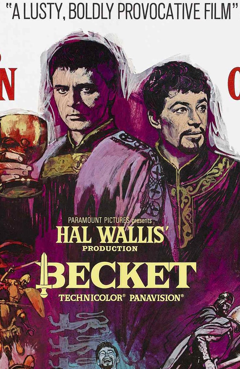
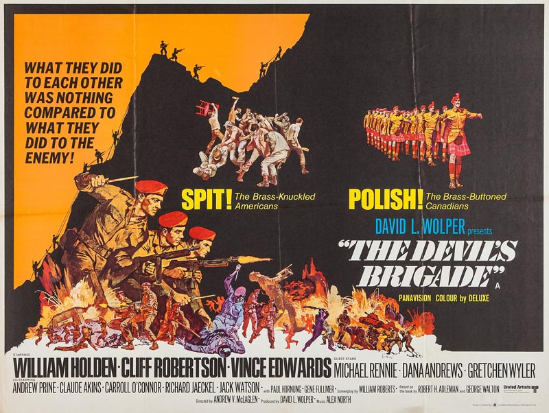
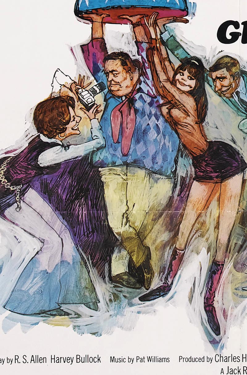
SK: Well, this happened to be a very happy circumstance. Paramount Pictures is very lenient, and they're open to new ideas. Consequently, all I was given by the art director was a rough, black-and-white sketch that had been approved. It consisted of the two main figures and an indication of the montage.

Kossin49

SK: But in doing a movie poster like this you run into other problems, like billing, where one head must not be larger than the other. Their contracts, I guess, stipulate that both heads must be of equal size, and one must not be higher than the other. Now, if one is definitely the star, he will get his billing. In this case we had Richard Burton and Peter O'Toole, and I believe that Burton in that illustration may be the same size, but I think he's just a bit higher on the page. It probably meant he got top billing.

Kossin49.detail03

HR: Then movie posters, in a sense, dictate your composition?

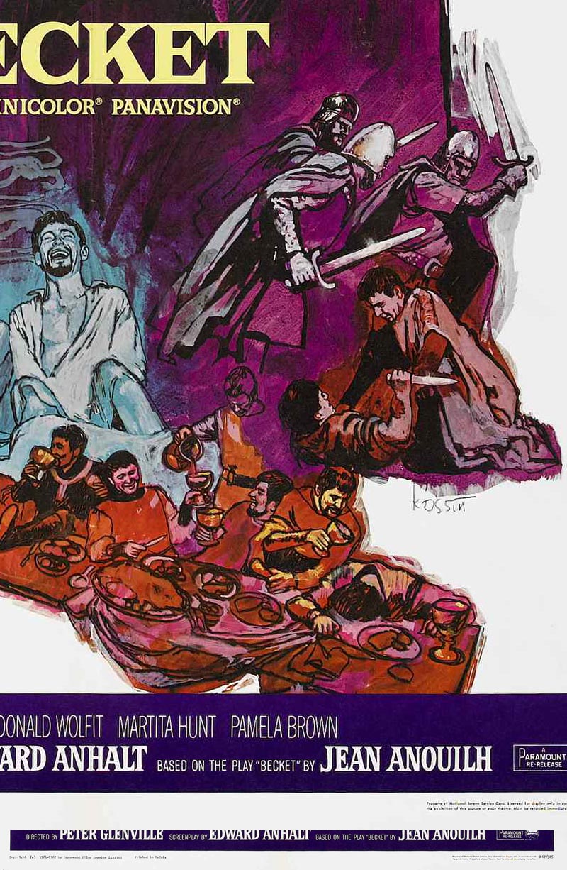
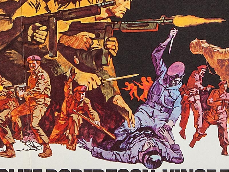
SK: This is what I call my limitations. In the Beckett I presented two large figures of the stars, and around them, in a montage, I depicted provocative scenes from the motion picture.

Kossin49.detail01

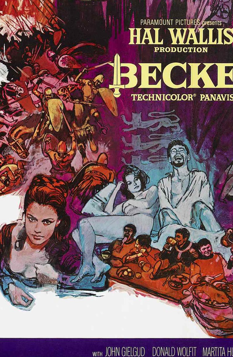
SK: My job was to fill the space in a clever fashion. I received from the movie people many stills that were taken by the photographers on the set. There may be as many as two to five hundred. It takes me a full day to go through them, at which time I may select one hundred or more that I feel will fit into this composition. Another long editing session on my part helps me to select those I feel will be useful to me.

Kossin49.detail02

HR: Are these prints in colour?

SK: No, all are in black-and-white.

HR: How do you determine the coloration? Does the art director help?

SK: No, in most cases he leaves that up to my own tastes. In this case, I used purple and blue predominantly, with warm colors running through it, because of the obviously royal subject matter. The hot reds and oranges give a feeling, I hope, of the life and adventure that was basic to this movie.

HR: Sandy, what are those strips of illustration board behind your drawing table? The ones with the color swatches and varieties of textures?

Kossin50

SK: I use them constantly to check relativity of color. Here is a brilliant intense red that goes brown when I place this fluorescent orange next to it.

Kossin51

SK: I'd rather rather have it show up here than on my painting. That could be painful.

Kossin51.detail01

SK: The textures are experiments with modeling paste to see how much impasto I can use without cracking the surface.

Kossin46

HR: Tell me, do you police the area as you go along or do you save all those little corrections for the end for a general housecleaning?

Kossin46.detail02

SK: If there's something in my picture that I don't like, I correct it right then and there because each step dictates the next step in a painting. That's why it's so advisable for me not to work on one area and complete it before going on to another. You change and you readjust and it's really a juggling job.

Kossin46.detail01

SK: I guess by policing you mean the little nicks, slips of the brush or pen. Sure, I correct those too as I move along. Some of them I leave in, because some accidents make for variety.

Kossin47

Kossin48

* Concluded tomorrow

* Many thanks to Heritage Auctions for allowing me to make use of scans from their image archives in today's post.
Email ThisBlogThis!Share to XShare to FacebookShare to Pinterest
Posted in | No comments
Newer Post Older Post Home

0 comments:

Post a Comment

Subscribe to: Post Comments (Atom)

Popular Posts

  • Bruce Johnson, Canadian Illustrator
    Here's a wonderful early '60s illustration by Canadian illustrator Bruce Johnson. Unfortunately, there isn't a lot of informatio...
  • Leon Gregori: "... he would draw and draw and draw."
    There are some illustrators of the mid-century whose work I have come across time and again in my collection of old magazines about whom the...
  • Lowell Hess: "I had a reputation as an artist with talent."
    "As I grew up," writes Lowell Hess the introduction to his new book , "it was my only interest to make pictures." And p...
  • Good-bye Mitchell Hooks (1923 - 2013)
    A couple of days ago on Facebook, Dan Zimmer of Illustration Magazine shared some sad news: last weekend, Mitchell Hooks passed away. How p...
  • Model Kit Box Art by "the Two Roys"
    By Guest Author, Roger O'Reilly For anyone growing up in Britain or Ireland in the 70's and 80's who had half an interest in bui...
  • Michael Johnson: "I looked forward to being surprised, and always delighted, with what he produced."
    Guest author Bryn Havord introduces the early work of English illustrator Michael Johnson, covering the decade of his work, from the end of...
  • The Art of Summer Reading: Mercer Mayer
    Among all the beloved, memorable books of my childhood, I probably hold no other series in higher esteem than I do John D. Fitzgerald's ...
  • Barbara Bradley: A Female Illustrator You Should Know
    Last week I received, once again, a comment from a reader asking "what about the female illustrators of the mid-20th century?" Th...
  • The Art of Summer Reading: Robert McCloskey
    I wonder if anyone else remembers the terrific "Henry Reed" series of chapter books, illustrated by Robert McCloskey. I've me...
  • Howard Terpning, Magazine Illustrator
    Today most people think of Howard Terpning as one of America's premier western art painters. Terpning's prints and paintings can be...

Blog Archive

  • ▼  2013 (68)
    • ►  August (3)
    • ►  July (4)
    • ►  June (12)
    • ►  May (4)
    • ►  April (6)
    • ►  March (10)
    • ▼  February (16)
      • A Visit with Mitchell Hooks, Part 4
      • A Visit with Mitchell Hooks, Part 3
      • A Visit with Mitchell Hooks, Part2
      • A Visit with Mitchell Hooks, Part 1
      • Sandy Kossin: "... I found out some time ago that ...
      • Sandy Kossin on Movie Poster Design: "My job [is] ...
      • Sandy Kossin on his Bay of Pigs series: "Life maga...
      • Sandy Kossin: "... the composition to me is a most...
      • The Franklin McMahon Interview, Part 3: "This is m...
      • The Franklin McMahon Interview, Part 2
      • The Franklin McMahon Interview, Part 1
      • Franklin McMahon: Artistry from Mundanity
      • Franklin McMahon: "The artist must get out of the ...
      • Meet Franklin McMahon
      • Franklin McMahon: "What I lose in accuracy I make ...
      • Murray Tinkelman on the New Reality of the 1970s
    • ►  January (13)
  • ►  2012 (127)
    • ►  December (3)
    • ►  November (2)
    • ►  October (10)
    • ►  September (8)
    • ►  August (10)
    • ►  July (17)
    • ►  June (20)
    • ►  May (14)
    • ►  April (3)
    • ►  March (13)
    • ►  February (15)
    • ►  January (12)
  • ►  2011 (146)
    • ►  December (17)
    • ►  November (11)
    • ►  October (9)
    • ►  September (16)
    • ►  August (15)
    • ►  July (5)
    • ►  June (9)
    • ►  May (11)
    • ►  April (15)
    • ►  March (10)
    • ►  February (16)
    • ►  January (12)
  • ►  2010 (159)
    • ►  December (10)
    • ►  November (18)
    • ►  October (11)
    • ►  September (9)
    • ►  August (23)
    • ►  July (15)
    • ►  June (12)
    • ►  May (15)
    • ►  April (17)
    • ►  March (21)
    • ►  February (8)
Powered by Blogger.

About Me

Unknown
View my complete profile