Let's get back to the Montreal Eaton's fashion art team later.
Today, I want to share with you a couple of ads I found by a Canadian cartoonist who signed his work with just his last name: "McLauchlan"

Both these ads were for a Toronto art supplier called E.E. Tigert. The first ad appeared in the 1960 Toronto Art Director's Annual, and the second one appeared in the '65 Graphica, an annual sponsored by the art directors clubs of Montreal, Toronto and Vancouver.
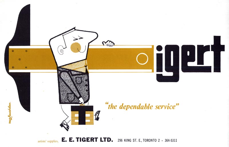
Though this is only a tiny comparative sampling, McLauchlan's style seems to have changed over five years. While certainly very accomplished and appealing, it does seem just a bit dated for the mid-'60s, doesn't it?

I have a few Canadian magazines from the early 1960s (they're a lot harder to come by than their American counterparts!) but I didn't manage to locate any other work - signed or unsigned - by McLauchlin. The closest in resemblance that I've ever found is this 1959 Bacardi ad, done for the U.S. market.
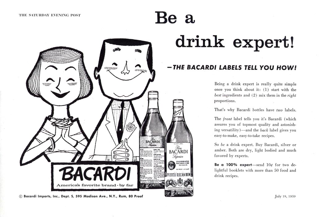
Here is that same scrumbly line, the same thick-thin line weight combination...

... but McLauchlin's work from 1960 looked much less like this than it did 5 years later, so it's probably not him.
Then there's this little multi-panel brochure for the Toronto Dominion Bank (a Canadian Bank). Again, not quite the same as McLauchlan's style, though it is similar - and no date on this, so its even harder to be sure. But its a Canadian ad piece so most like done by a Canadian cartoonist... possibly McLauchlan.

Most likely we're seeing several talented mid-century advertising cartoonists all embracing a popular ink line technique or style of that era.
As for McLauchlin, only time will tell if we ever learn anything more about him.
Today, I want to share with you a couple of ads I found by a Canadian cartoonist who signed his work with just his last name: "McLauchlan"

Both these ads were for a Toronto art supplier called E.E. Tigert. The first ad appeared in the 1960 Toronto Art Director's Annual, and the second one appeared in the '65 Graphica, an annual sponsored by the art directors clubs of Montreal, Toronto and Vancouver.

Though this is only a tiny comparative sampling, McLauchlan's style seems to have changed over five years. While certainly very accomplished and appealing, it does seem just a bit dated for the mid-'60s, doesn't it?

I have a few Canadian magazines from the early 1960s (they're a lot harder to come by than their American counterparts!) but I didn't manage to locate any other work - signed or unsigned - by McLauchlin. The closest in resemblance that I've ever found is this 1959 Bacardi ad, done for the U.S. market.

Here is that same scrumbly line, the same thick-thin line weight combination...

... but McLauchlin's work from 1960 looked much less like this than it did 5 years later, so it's probably not him.
Then there's this little multi-panel brochure for the Toronto Dominion Bank (a Canadian Bank). Again, not quite the same as McLauchlan's style, though it is similar - and no date on this, so its even harder to be sure. But its a Canadian ad piece so most like done by a Canadian cartoonist... possibly McLauchlan.

Most likely we're seeing several talented mid-century advertising cartoonists all embracing a popular ink line technique or style of that era.
As for McLauchlin, only time will tell if we ever learn anything more about him.


0 comments:
Post a Comment