* Although Charlie intended this to be one long post, I've split it into three parts and presented one part each day this week. This is the concluding installment ~ Leif
Finally, a couple of Gallo color ads, again I believe, slated for Sunday newspaper distribution. They may have been for magazines.
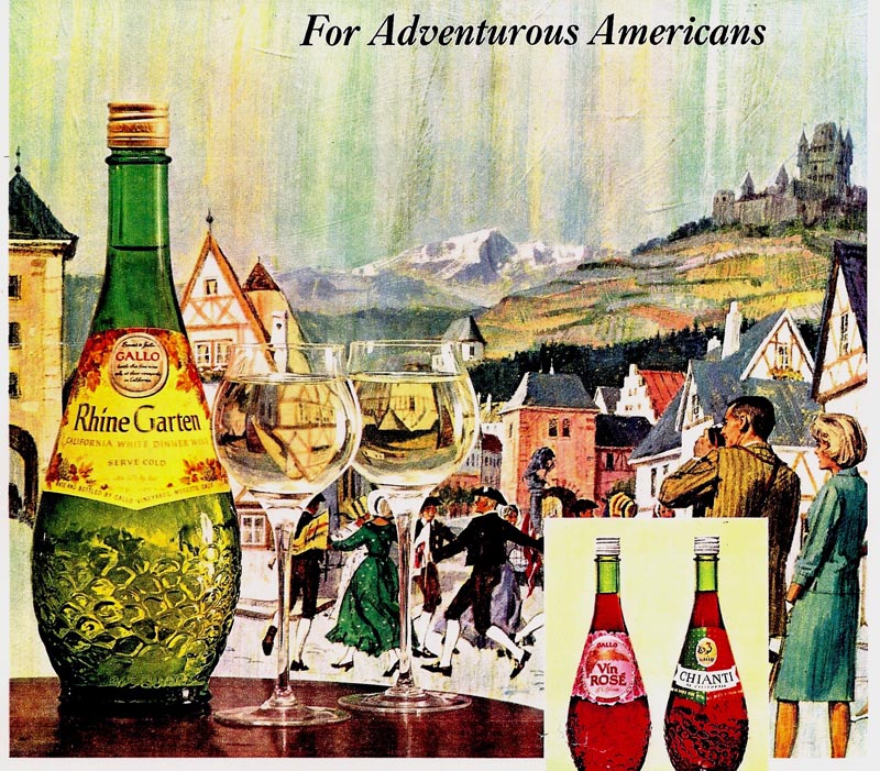
These both display Gallo's penchant for product up front and center... and the art set up and photographed with and through wine glasses and bottles.
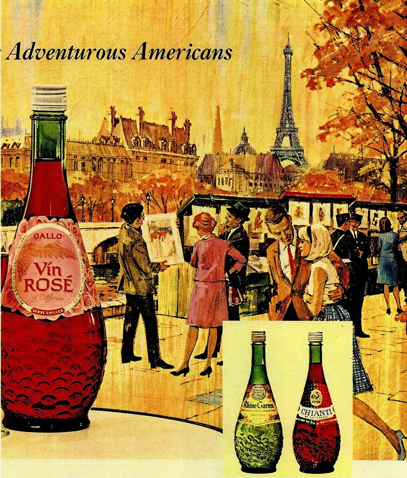
Foote-Cone was the agency, I believe, and the art suffered, to put it mildly. But, hey....we're selling wine here, aren't we?
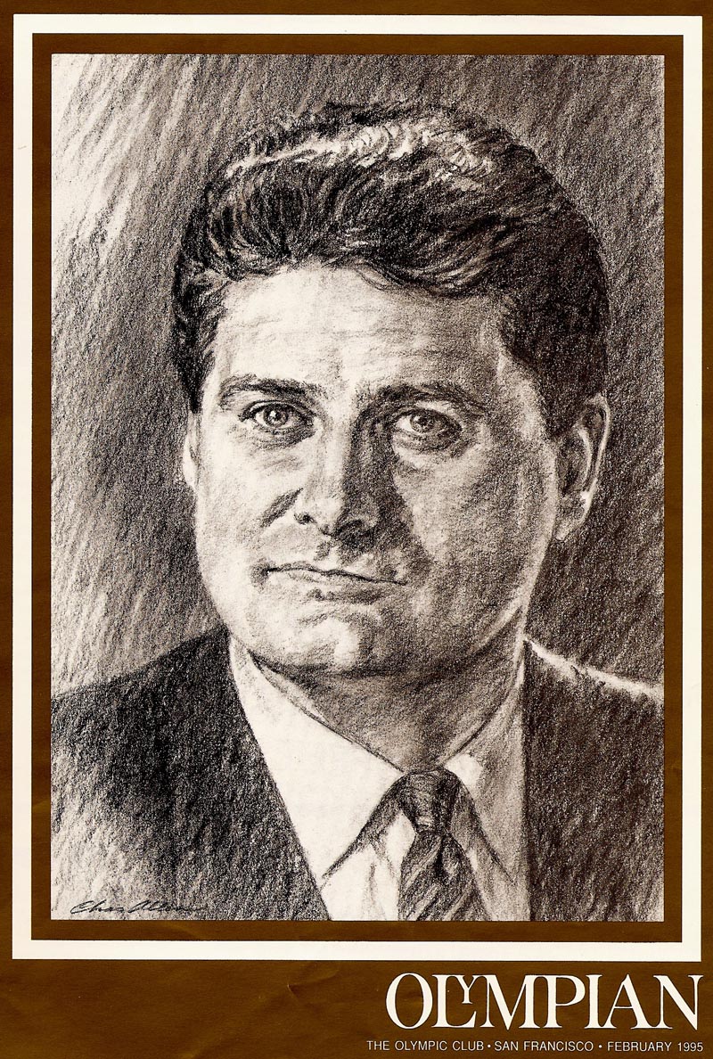
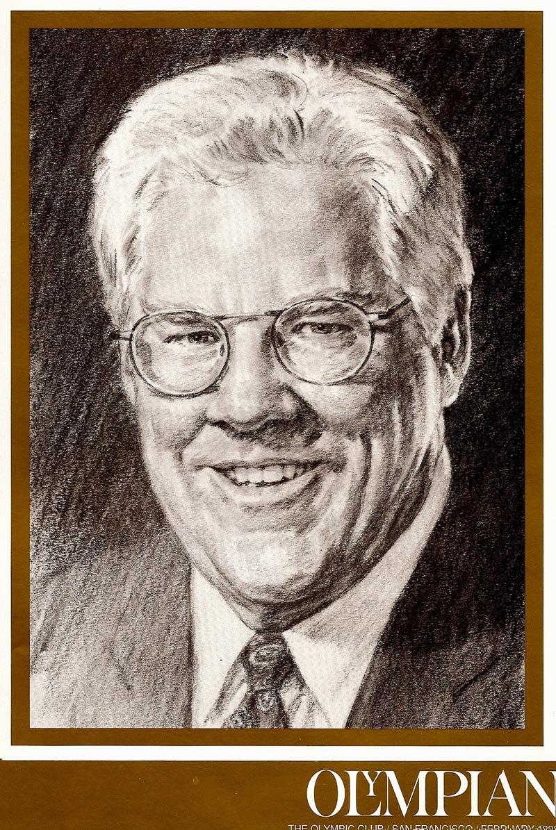
Finally, finally... I'll include three Olympic Club February covers. Their bi-monthly magazine, and on each, a portrait of the new year's next president. The lady illustrated was the very first woman president in the club's long history!
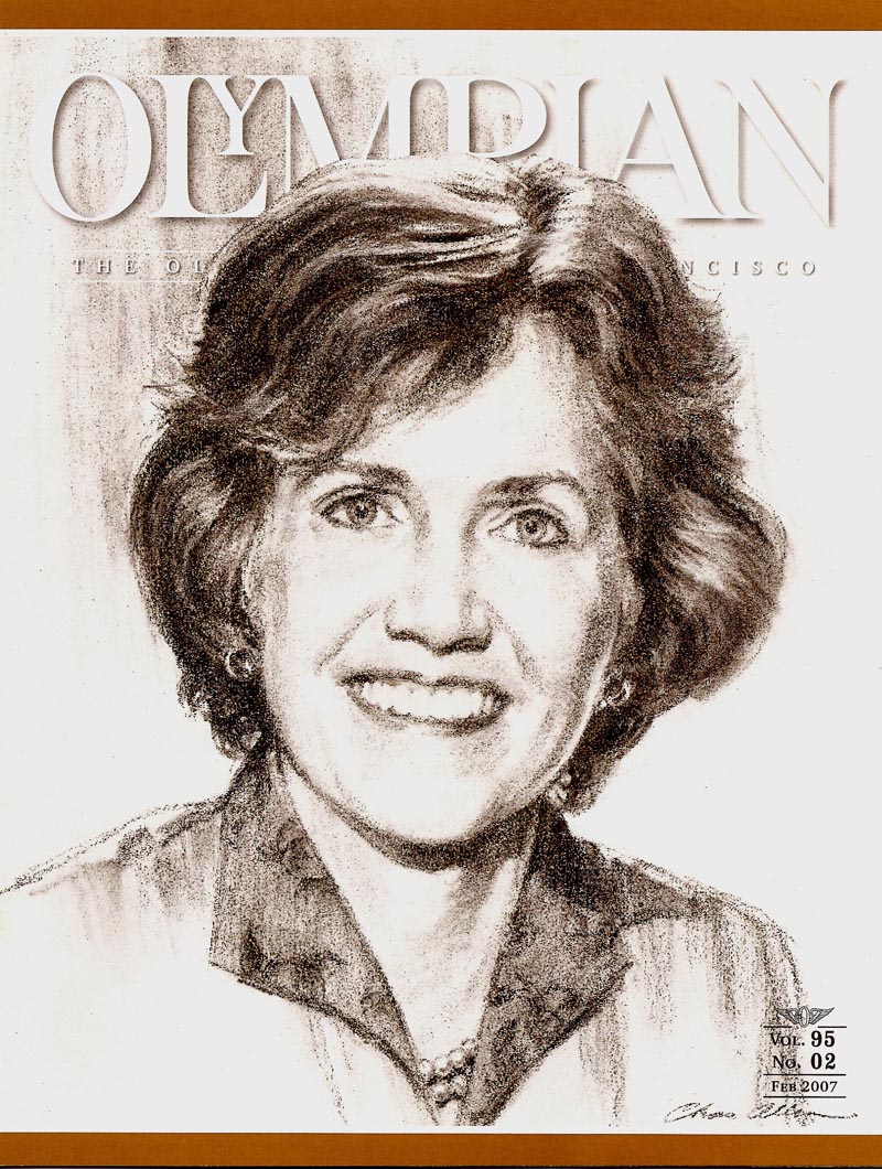
The original scan, as printed on the magazine, was strange... quite grainy. Evidently the pixels didn't get along with the texture of the charcoal drawing. The older two covers were printed in the regular 120 line screen.
Finally, finally, finally... a couple of State Fund 'local office' brochures in ink line and one color.
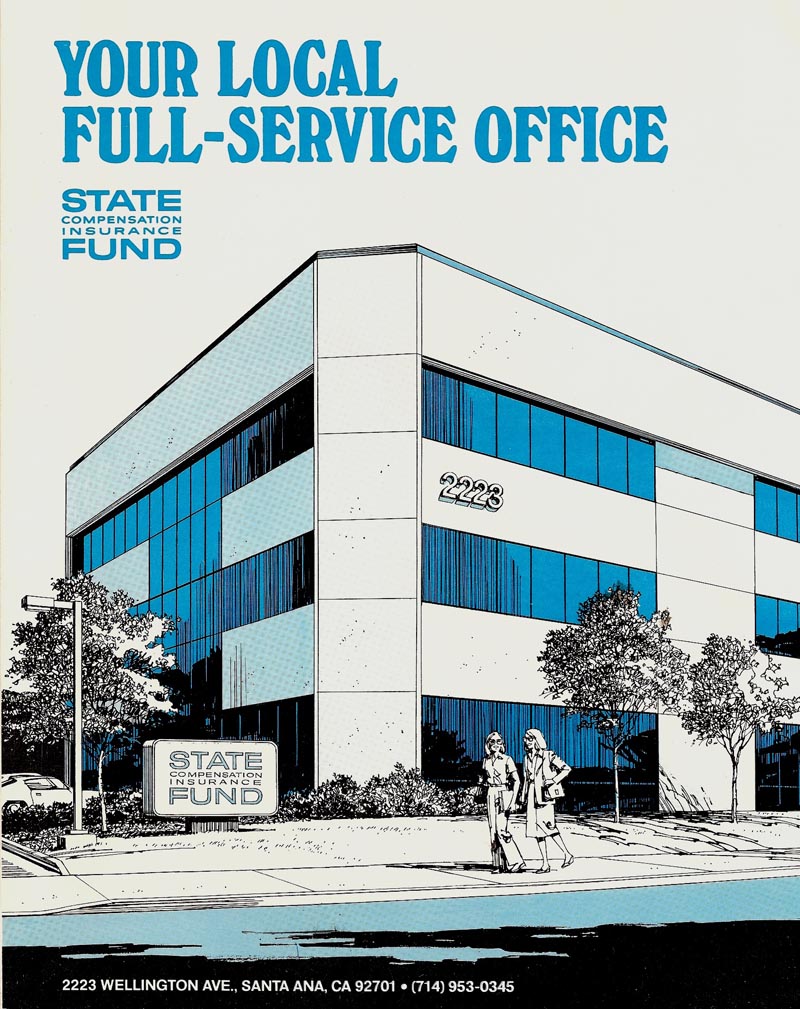
These would have looked less hard and mechanical had they been done in charcoal pencil.
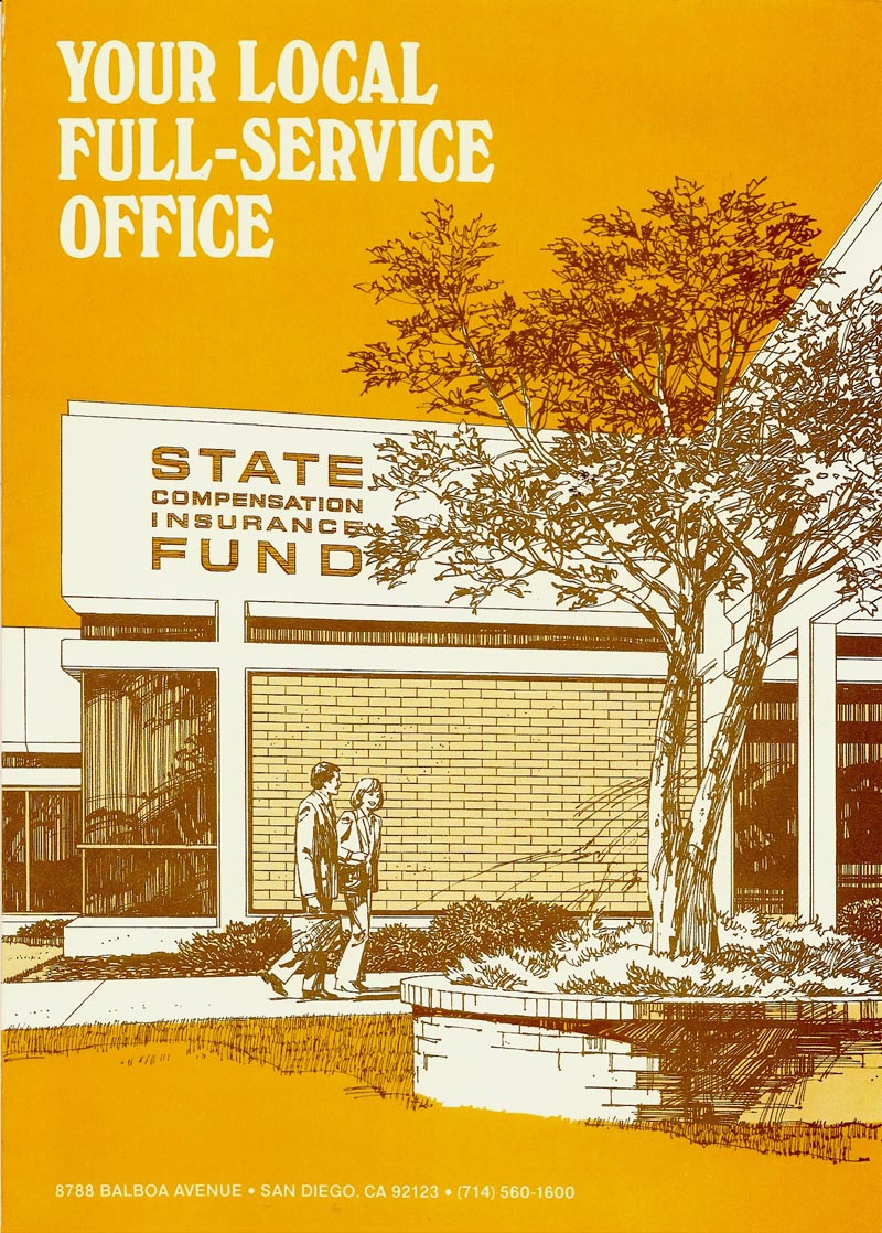
I believe in this case I was trying to vary the style from what I'd been doing before.
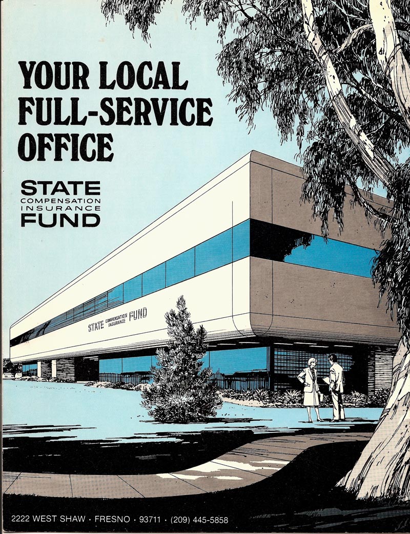
Anyway, none of these are exceptional... just the workaday world of this old San Francisco illustrator. Enough old Allen ads that they could make a one-shot CAWS. I label them 'also rans'... but it really is just some neglected stuff from way back.
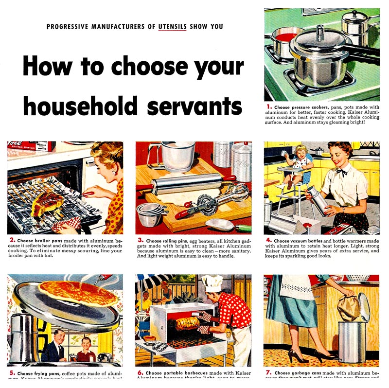
A couple not found earlier, a couple of 'rejects' that I'm willing to expose for some reason (hopefully to a forgiving bunch) and maybe a repeat (I just can't remember).
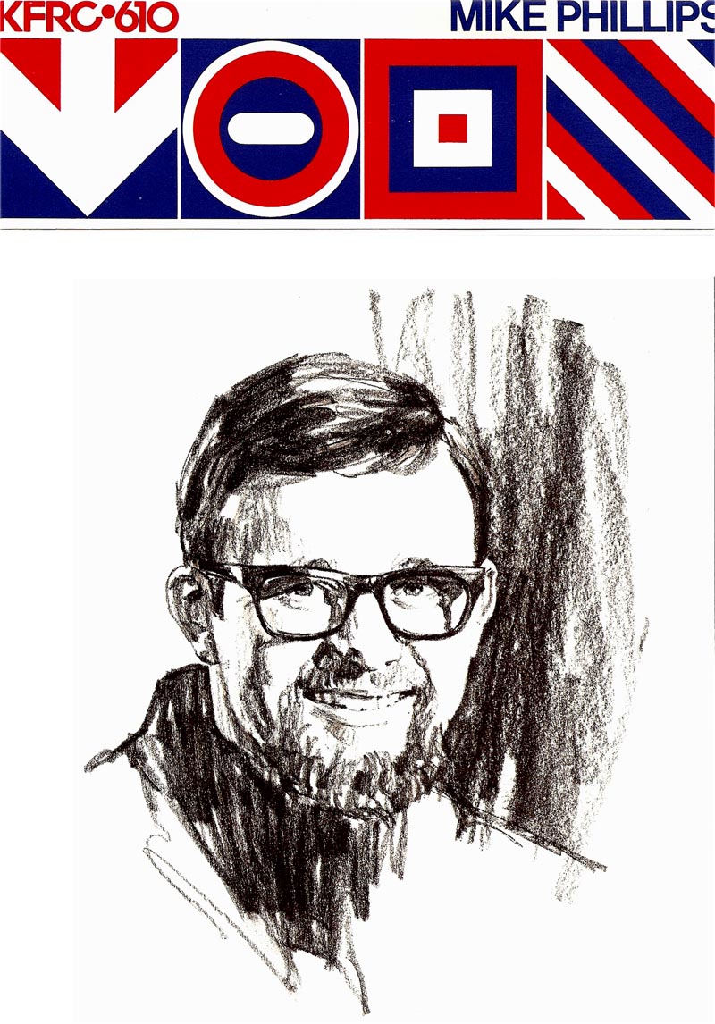
I really did have the advantage of variety in my assignments... and it kept me alive and interested.
Enough of this. Cheers ~ Chas.
Finally, a couple of Gallo color ads, again I believe, slated for Sunday newspaper distribution. They may have been for magazines.

These both display Gallo's penchant for product up front and center... and the art set up and photographed with and through wine glasses and bottles.

Foote-Cone was the agency, I believe, and the art suffered, to put it mildly. But, hey....we're selling wine here, aren't we?
Finally, finally... I'll include three Olympic Club February covers. Their bi-monthly magazine, and on each, a portrait of the new year's next president. The lady illustrated was the very first woman president in the club's long history!

The original scan, as printed on the magazine, was strange... quite grainy. Evidently the pixels didn't get along with the texture of the charcoal drawing. The older two covers were printed in the regular 120 line screen.


Finally, finally, finally... a couple of State Fund 'local office' brochures in ink line and one color.

These would have looked less hard and mechanical had they been done in charcoal pencil.

I believe in this case I was trying to vary the style from what I'd been doing before.

Anyway, none of these are exceptional... just the workaday world of this old San Francisco illustrator. Enough old Allen ads that they could make a one-shot CAWS. I label them 'also rans'... but it really is just some neglected stuff from way back.

A couple not found earlier, a couple of 'rejects' that I'm willing to expose for some reason (hopefully to a forgiving bunch) and maybe a repeat (I just can't remember).

I really did have the advantage of variety in my assignments... and it kept me alive and interested.
Enough of this. Cheers ~ Chas.


0 comments:
Post a Comment