InspirationWhodunnit

  • Subscribe to our RSS feed.
  • Twitter
  • StumbleUpon
  • Reddit
  • Facebook
  • Digg

Wednesday, 1 June 2011

The Noir Stylings of James R. Bingham

Posted on 09:33 by Unknown
Despite the obvious range of subject matter that James R. Bingham was clearly capable of handling with great proficiency, his work during the 1950s is, for me, epitomized by a long-running series he illustrated for the Saturday Evening Post...

Bingham72.detail01

Erle Stanley Gardner's "Perry Mason."

Bingham72

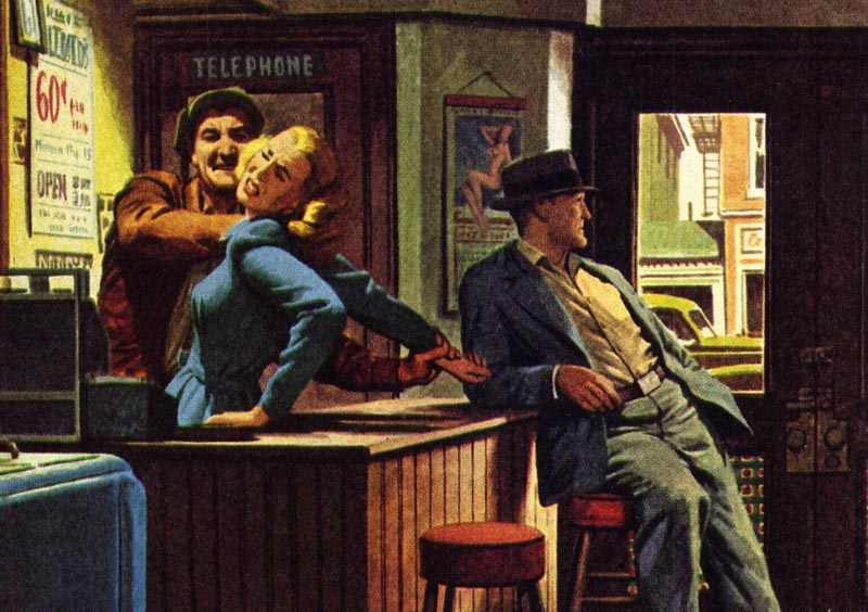
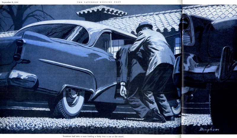
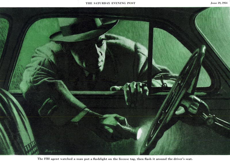
Here Bingham's work truly captured the sumptuous atmospheric stylings of the best of film noir.

Bingham74

Bingham's flair for portraying all the grit and guts of classic hard-boiled crime fiction makes this decade-long series of illustrations, in my opinion, one of the finest - yet most under-appreciated - of the genre.

Bingham75

Bingham68

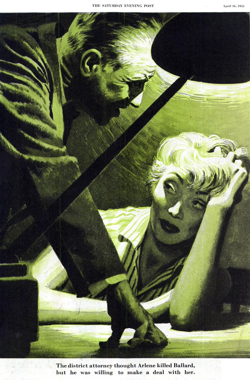
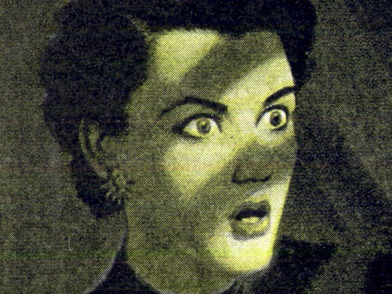
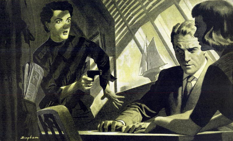
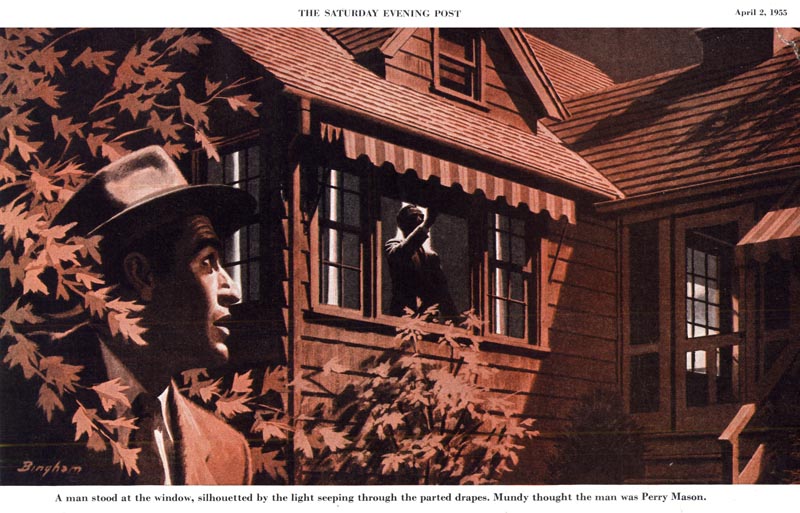
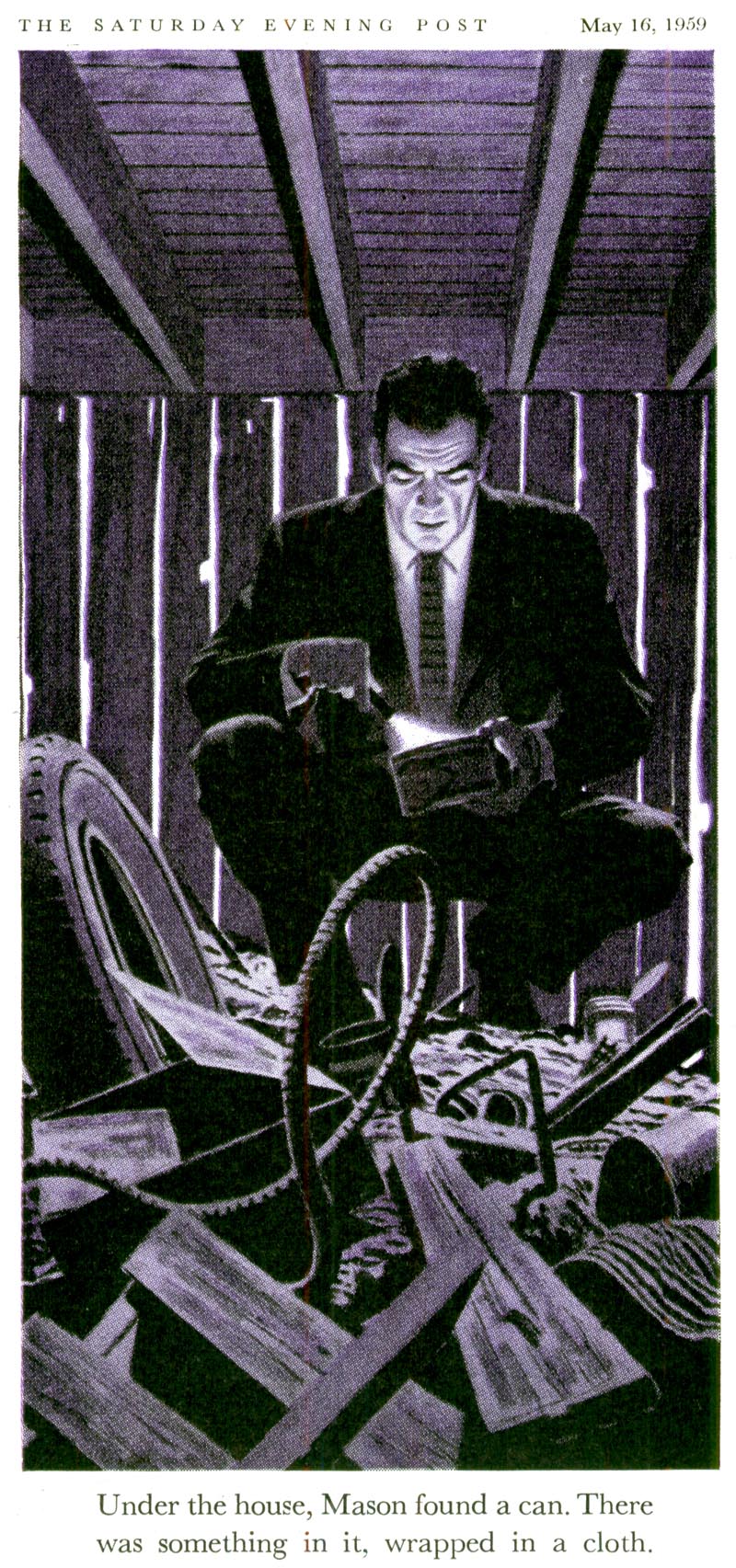
But there's another deeper wrinkle - and one I'd only recently considered - in Bingham's Perry Mason art. Have a look at this dramatic piece by Bingham. Once you're ready to move beyond the obviously disturbing events unfolding in the subject matter of the story Bingham is illustrating...

Bingham76.detail01

... you discover a composition - really, a work of art - worthy of far greater contemplation. Here I see such careful consideration of the picture elements, such sophisticated appreciation of how to create a sense of ambiance, so much more than just a captured moment of a pulp fiction story... I'm floored by Bingham's masterful juxtaposition of the necessary violence of the story within a larger scene that quietly breathes with a strange sense of serenity.

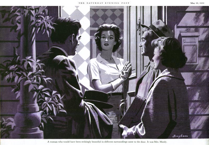
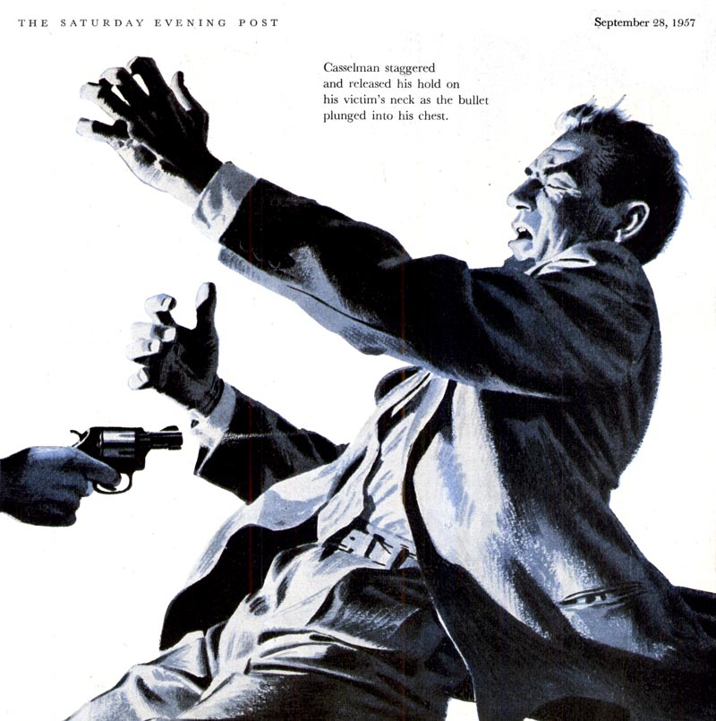
I find there is an Edward Hopper-esque quality to Bingham's work during this period that I had not previously noticed. Set aside the crime drama subject matter and you will see in this series a quiet, contemplative examination of some intriguingly familiar urban landscapes.

Bingham76

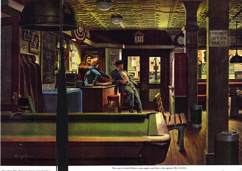
This quality is, I think, the real genius of much of James R. Bingham's Perry Mason art, as seen in these examples below.

Bingham67

Bingham63

Bingham64

In the early years of the series, Bingham seems to have created his Perry Mason from personal vision. In fact his son, Jim Jr., told me "because he didn't have anything but a story line to work with, he developed [the look] on his own from the story and it seemed to work. Dad had very few corrections. And I know he enjoyed it, in fact in a lot of the work he used family faces & postures (but didn't pay fair rates, often in ice cream & movies)."

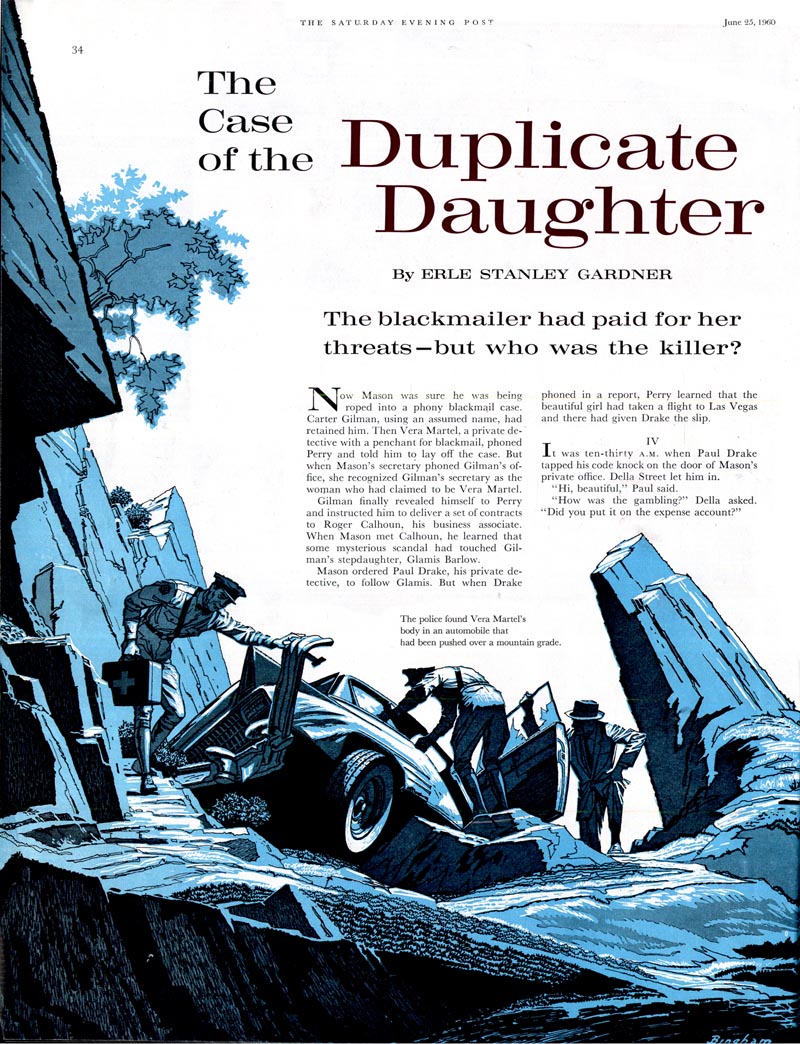
But around 1957, Bingham's Perry Mason began to look very much like the actor, Raymond Burr.

Bingham65

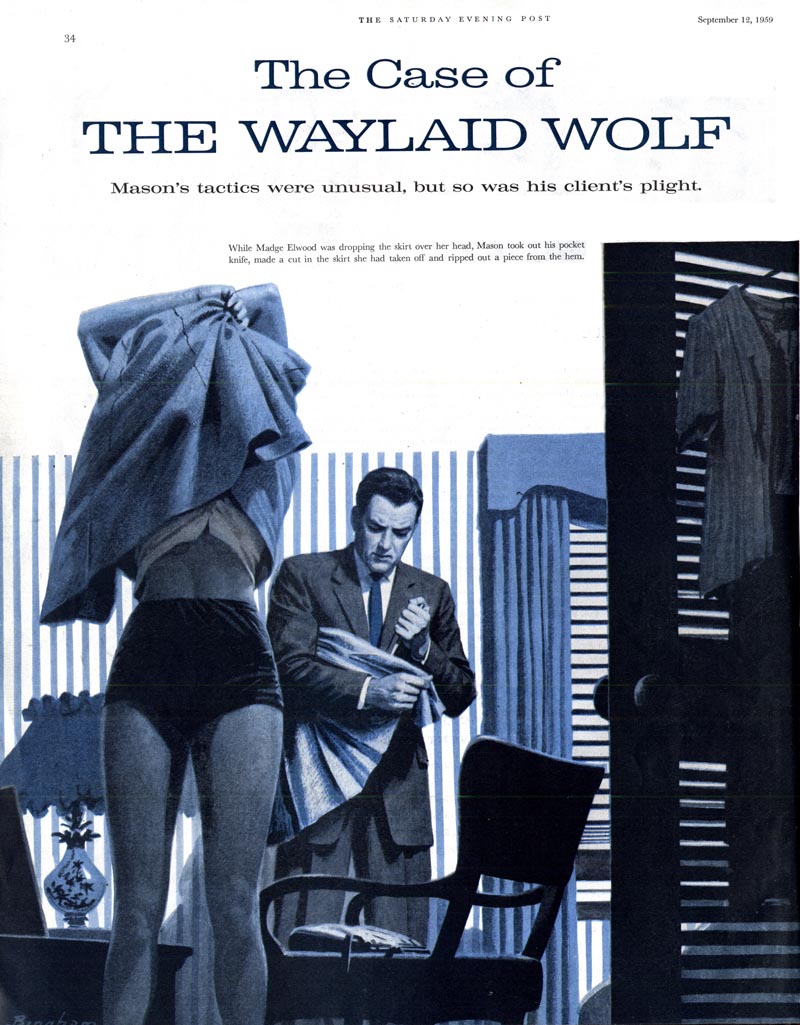
This only makes sense, as Burr had begun portraying Mason that year in what would become a popular television series that ran until 1966.

Bingham62

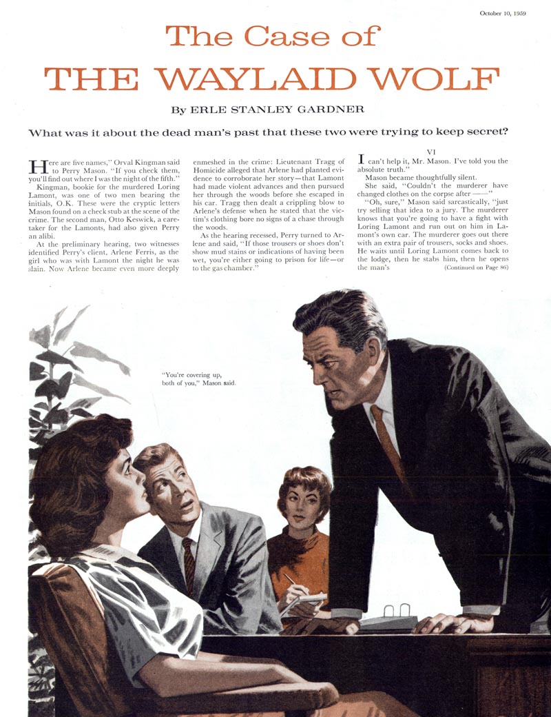
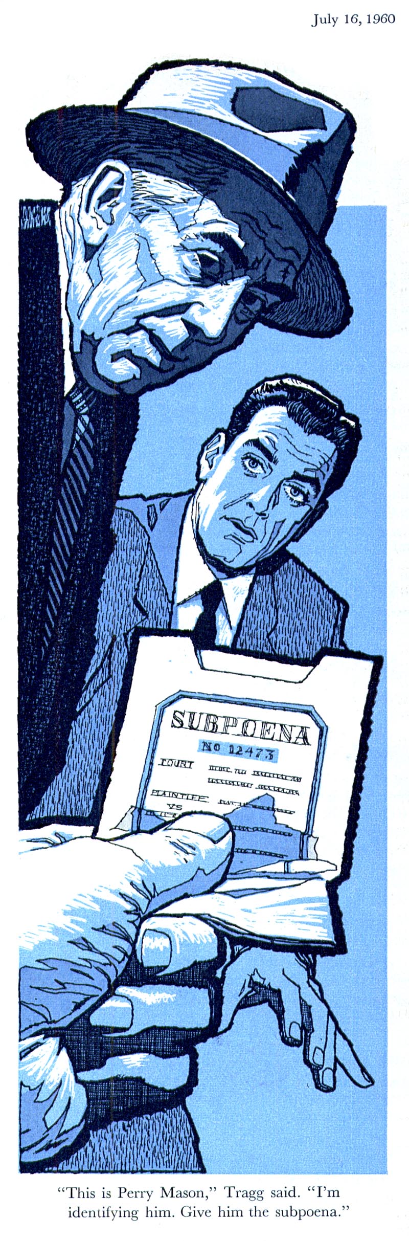
Bingham continued to employ his successful fully-painted style to these illustrations until 1959...

Bingham73

... when he abruptly switched gears and introduced readers to an impactful, modern line style he seemingly created out of whole cloth.

Bingham71

Whether this change was self-motivated or a request from the Post's editors is unknown.

Bingham70

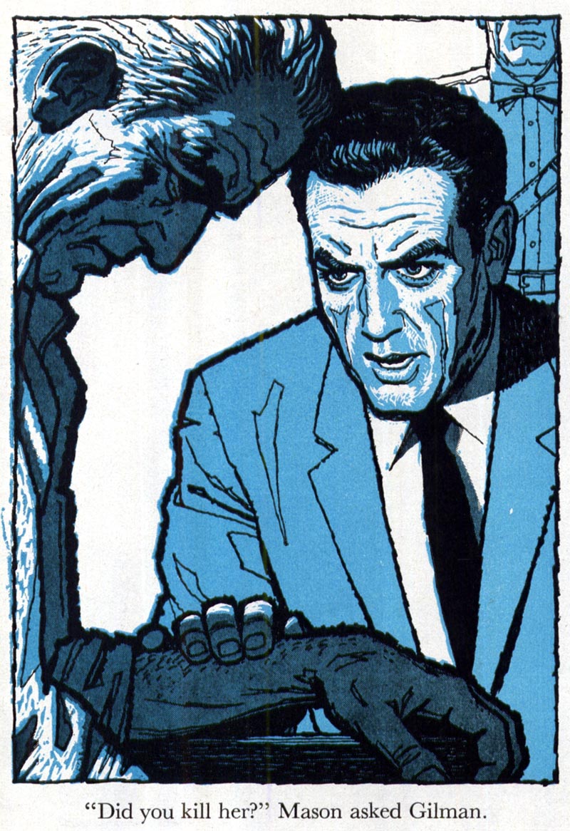
But it strikes me as obvious that Bingham's earlier, painterly style was becoming dated and that this new look was an attempt to keep the series looking fresh, stylish and contemporary.

Bingham69

After all, illustrators and the magazine business were facing a new decade and new challenges. Tomorrow, we'll see how James R. Bingham fared in those changing times.

* Many thanks to TI list member Bruce Hettema, owner of P&H Creative Group, who sent me a huge package of old tearsheets from the early days of his studio, when it was known as Patterson & Hall, a San Francisco-based advertising art studio. Among those tearsheets were some of the images you see in todays post - most importantly, the full colour piece which was so revelatory for me.

* Thanks also to Bill Peckmann, who sent a note the other day - perfect timing! - pointing me to an Edward Hopper post he contributed to Michael Sporn's Splog. Check it out and see if you agree with me that Hopper may very well have been an influence on James R. Bingham.
Email ThisBlogThis!Share to XShare to FacebookShare to Pinterest
Posted in | 1 comment
Newer Post Older Post Home

1 comment:

  1. Leah-Ariadne4 November 2018 at 13:16

    Just discovered this, via a reference to him on Facebooj. Great post! Will read more of your blog!

    ReplyDelete
    Replies
      Reply
Add comment
Load more...

Subscribe to: Post Comments (Atom)

Popular Posts

  • Bruce Johnson, Canadian Illustrator
    Here's a wonderful early '60s illustration by Canadian illustrator Bruce Johnson. Unfortunately, there isn't a lot of informatio...
  • Leon Gregori: "... he would draw and draw and draw."
    There are some illustrators of the mid-century whose work I have come across time and again in my collection of old magazines about whom the...
  • Lowell Hess: "I had a reputation as an artist with talent."
    "As I grew up," writes Lowell Hess the introduction to his new book , "it was my only interest to make pictures." And p...
  • Good-bye Mitchell Hooks (1923 - 2013)
    A couple of days ago on Facebook, Dan Zimmer of Illustration Magazine shared some sad news: last weekend, Mitchell Hooks passed away. How p...
  • Model Kit Box Art by "the Two Roys"
    By Guest Author, Roger O'Reilly For anyone growing up in Britain or Ireland in the 70's and 80's who had half an interest in bui...
  • Michael Johnson: "I looked forward to being surprised, and always delighted, with what he produced."
    Guest author Bryn Havord introduces the early work of English illustrator Michael Johnson, covering the decade of his work, from the end of...
  • The Art of Summer Reading: Mercer Mayer
    Among all the beloved, memorable books of my childhood, I probably hold no other series in higher esteem than I do John D. Fitzgerald's ...
  • Barbara Bradley: A Female Illustrator You Should Know
    Last week I received, once again, a comment from a reader asking "what about the female illustrators of the mid-20th century?" Th...
  • The Art of Summer Reading: Robert McCloskey
    I wonder if anyone else remembers the terrific "Henry Reed" series of chapter books, illustrated by Robert McCloskey. I've me...
  • Howard Terpning, Magazine Illustrator
    Today most people think of Howard Terpning as one of America's premier western art painters. Terpning's prints and paintings can be...

Blog Archive

  • ►  2013 (68)
    • ►  August (3)
    • ►  July (4)
    • ►  June (12)
    • ►  May (4)
    • ►  April (6)
    • ►  March (10)
    • ►  February (16)
    • ►  January (13)
  • ►  2012 (127)
    • ►  December (3)
    • ►  November (2)
    • ►  October (10)
    • ►  September (8)
    • ►  August (10)
    • ►  July (17)
    • ►  June (20)
    • ►  May (14)
    • ►  April (3)
    • ►  March (13)
    • ►  February (15)
    • ►  January (12)
  • ▼  2011 (146)
    • ►  December (17)
    • ►  November (11)
    • ►  October (9)
    • ►  September (16)
    • ►  August (15)
    • ►  July (5)
    • ▼  June (9)
      • Ben Shahn: The Most Influential Illustrator of th...
      • Employment Opportunities for Fashion Illustrators
      • Merle Bassett: "Fashion illustration came so easil...
      • Fashion Illustration: "...it just keeps coming bac...
      • Happy Father's Day!
      • Six Degrees of Illustration Separation
      • The 1960 Dodge Trucks Campaign
      • James R. Bingham: "Art was his life and the rest ...
      • The Noir Stylings of James R. Bingham
    • ►  May (11)
    • ►  April (15)
    • ►  March (10)
    • ►  February (16)
    • ►  January (12)
  • ►  2010 (159)
    • ►  December (10)
    • ►  November (18)
    • ►  October (11)
    • ►  September (9)
    • ►  August (23)
    • ►  July (15)
    • ►  June (12)
    • ►  May (15)
    • ►  April (17)
    • ►  March (21)
    • ►  February (8)
Powered by Blogger.

About Me

Unknown
View my complete profile