


You could see hints of this sketchy style in the mid-to-late '50s paperback covers we looked at yesterday, couldn't you?

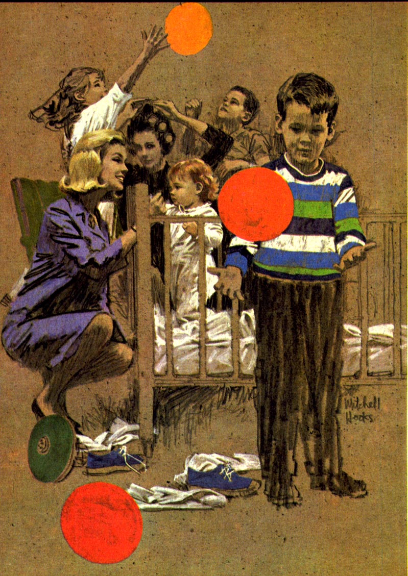
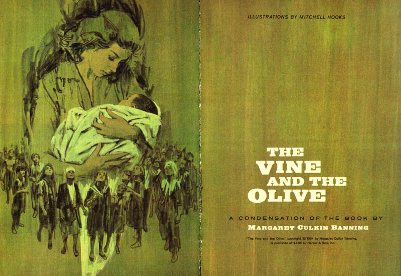
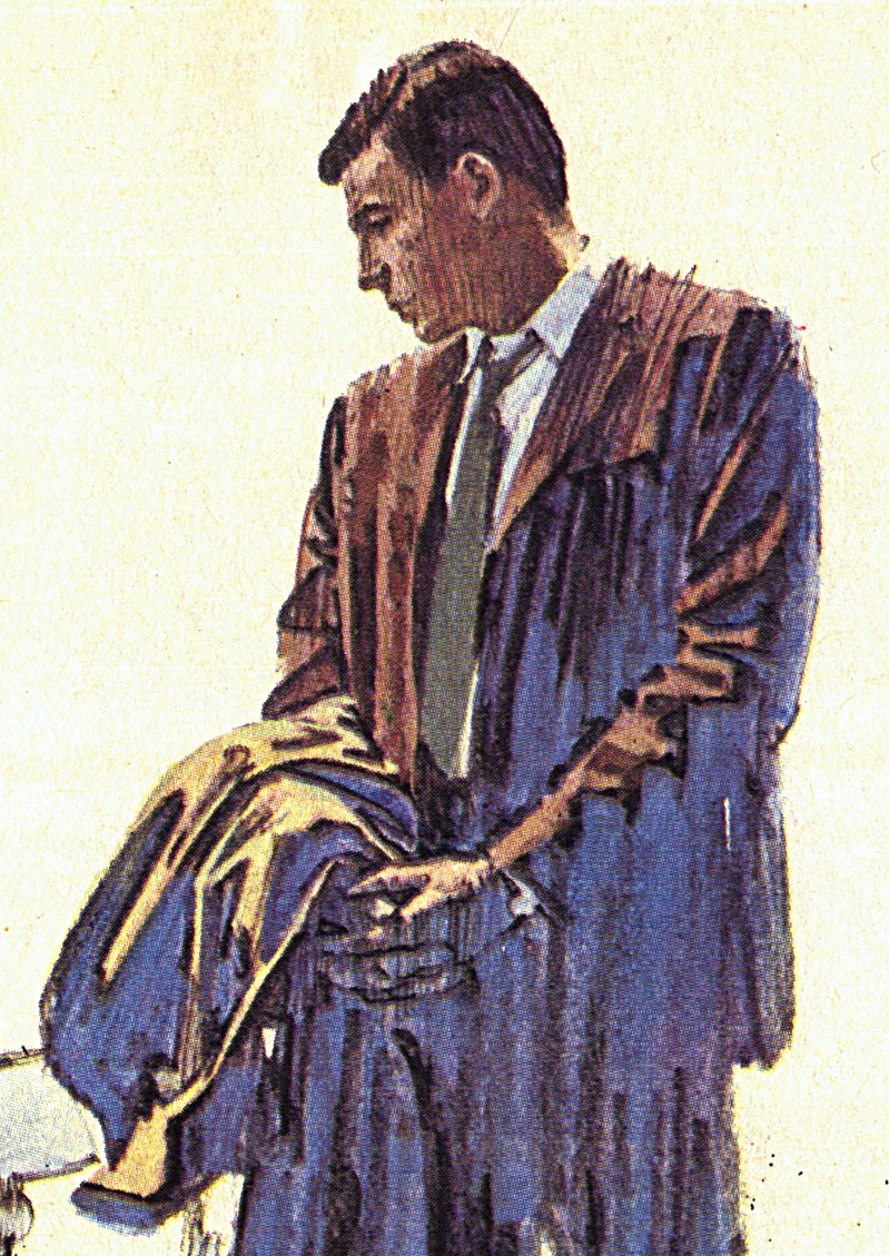
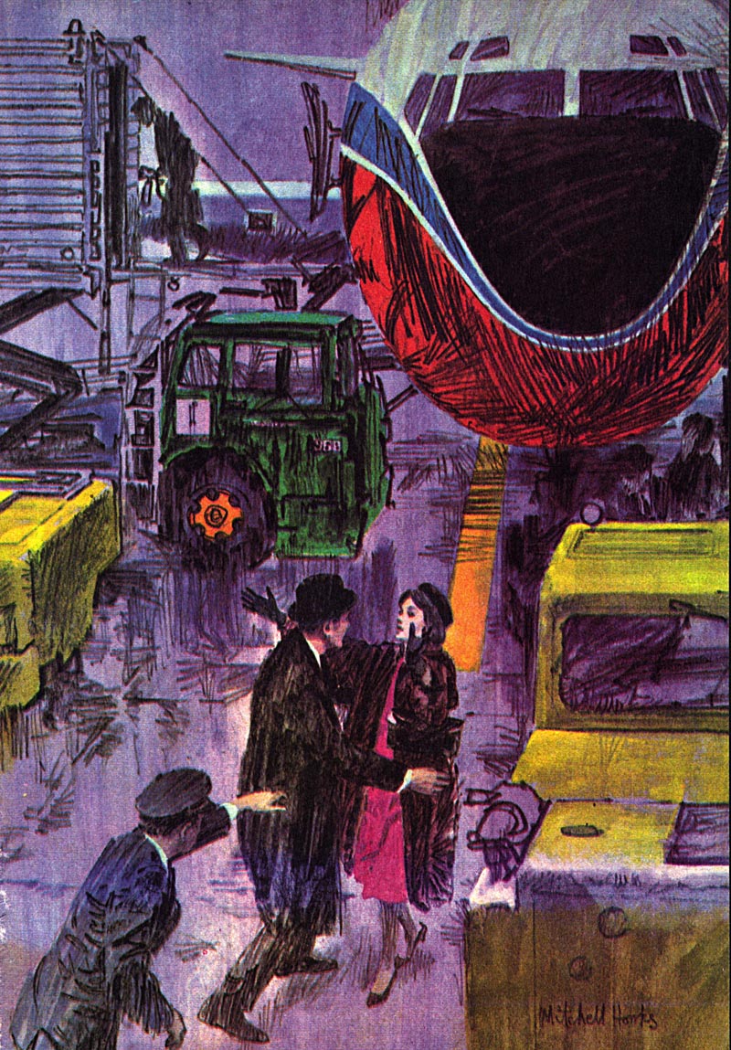
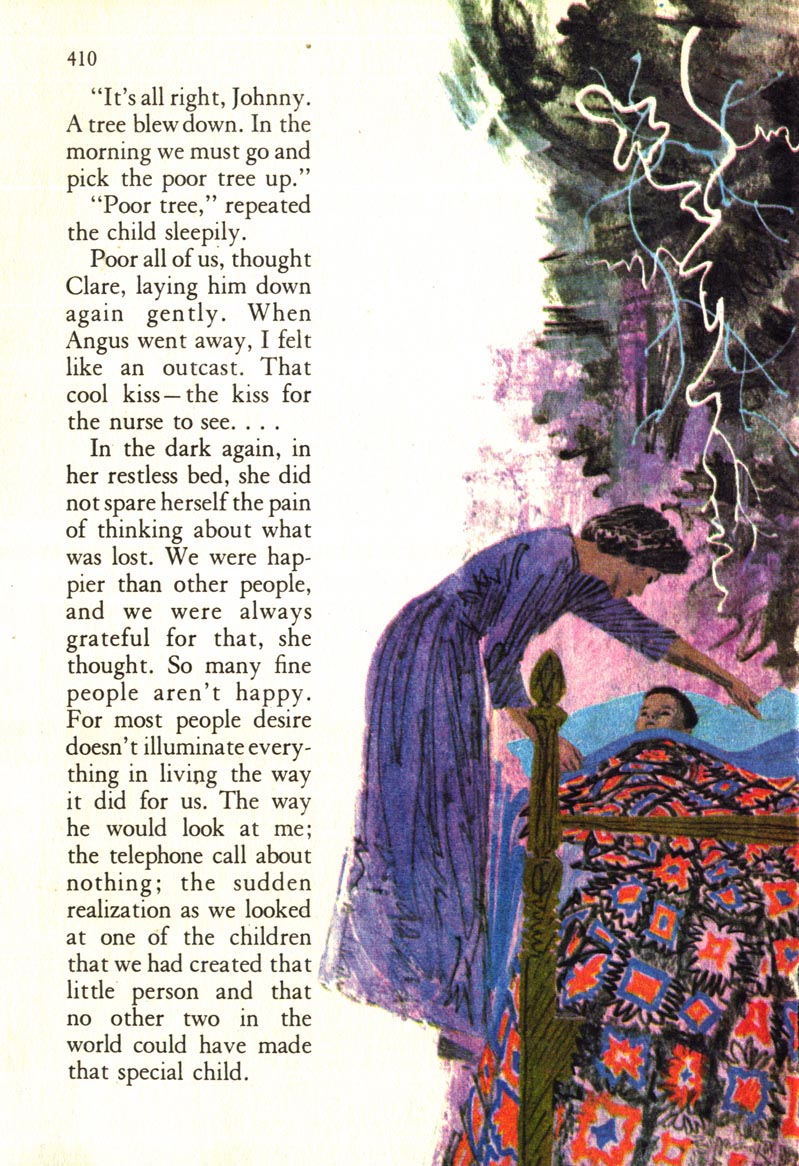
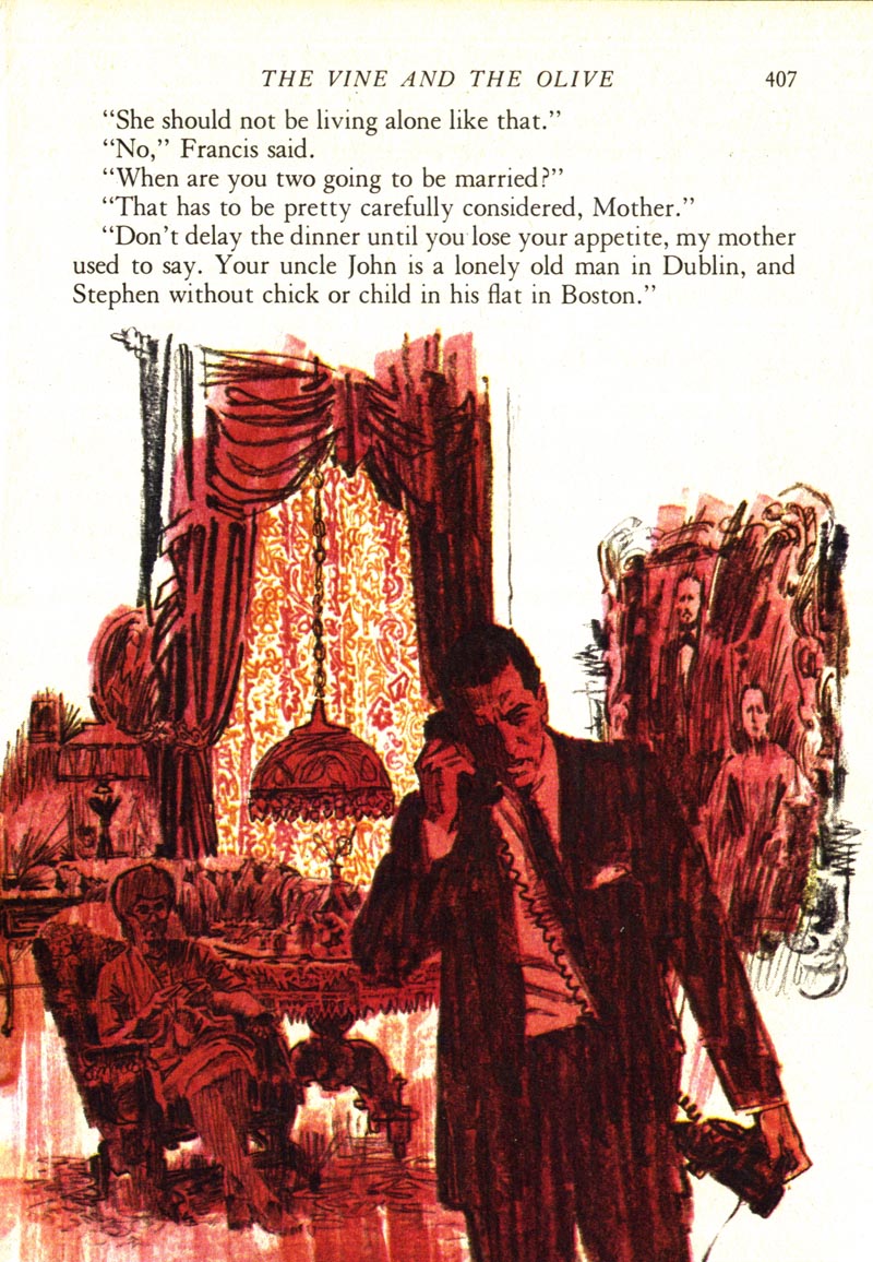
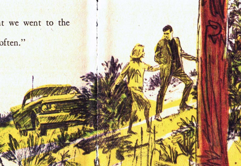
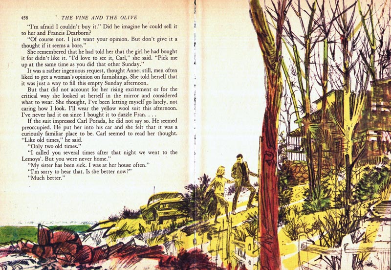
Frankly, I so love the technique Mitchell used for this series...
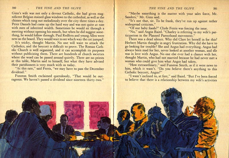
... that I had to include several close-cropped excerpts today. I wanted you to be able to see the detail; the lively action in that gorgeous sketchiness.
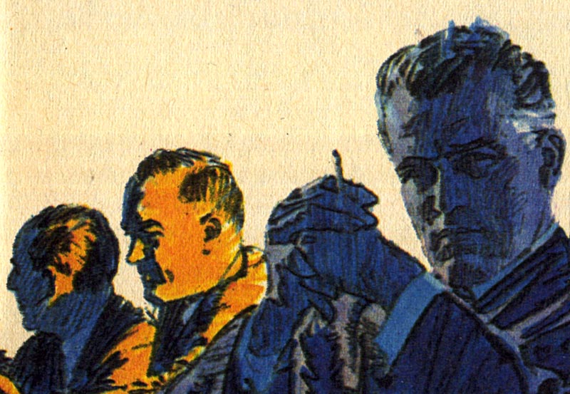
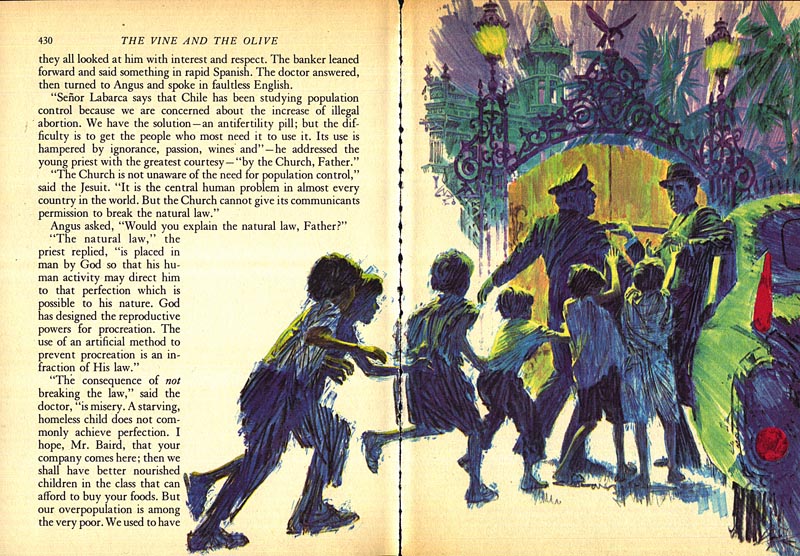
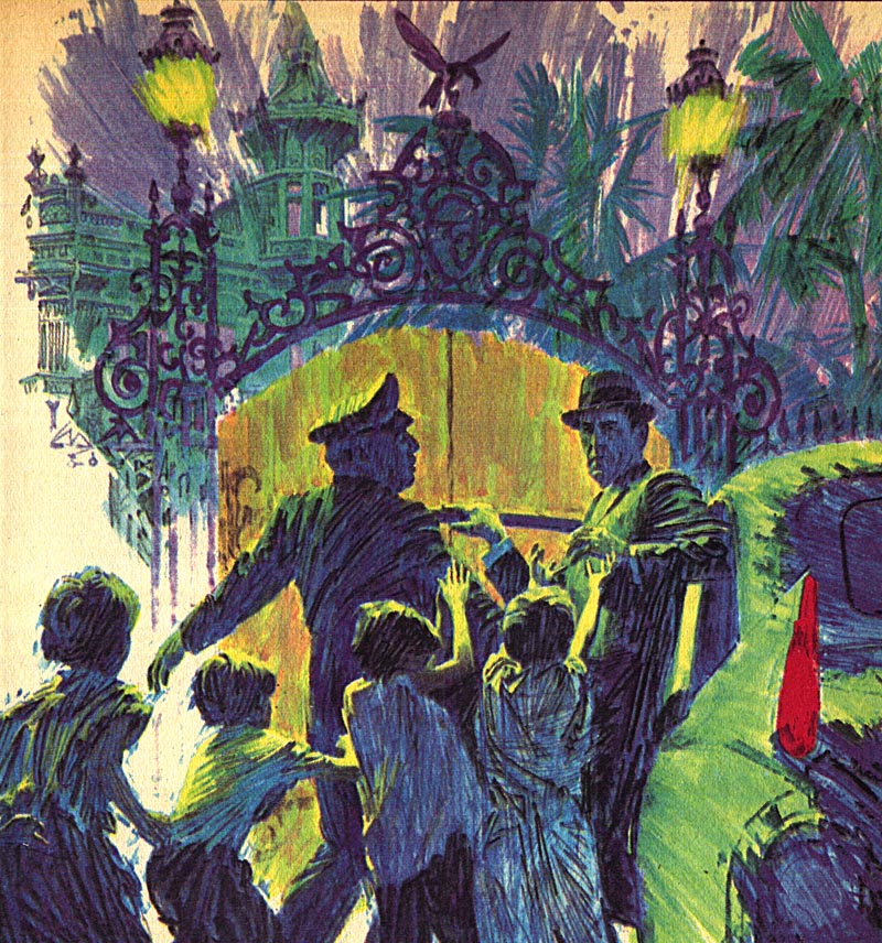
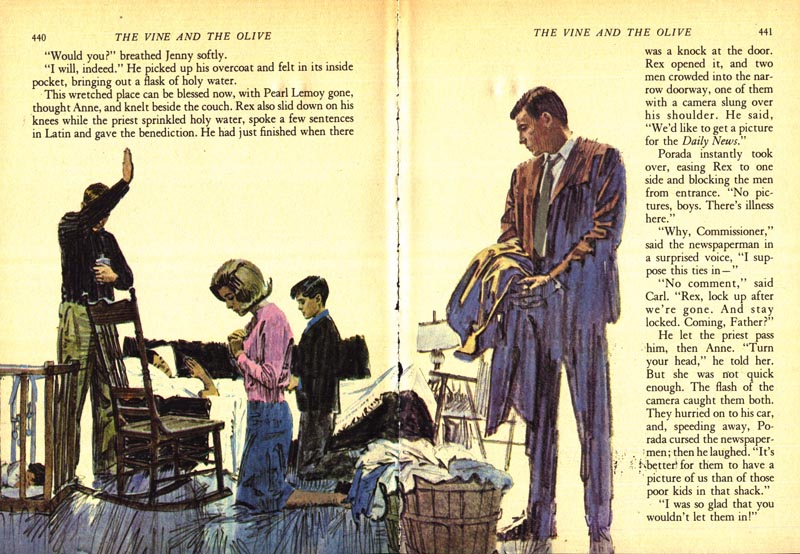
Also note the riotous use of strong, bright colour. Isn't it fantastic? A reflection of the times, I would guess (it was, after all, the '60s).
So who inspired all this sketchiness and these candy-bright, unnatural colour schemes?
No doubt there were many factors...
But I'll bet one major influence (not just on Mitchell, but on the whole industry) was Bob Peak.
* My Mitchell Hooks Flickr set.


0 comments:
Post a Comment