Art directors and brand managers; why why why won't you invest yourselves in seeking out today's Bob Peaks and assigning them to major national ad campaigns like this? Why the same old photo solution as all your competitors again and again and again? Isn't the idea to stand out from the crowd and grab the public's attention?

Today's Inspiration isn't just for illustrators to learn about the history of their industry... my hope is always that our clients also will see potential in these examples for whatever they happen to be working on today. I know many of you read this blog... it would be interesting to get your perspective on this situation. I invite you to take a good long serious look and then leave a comment.

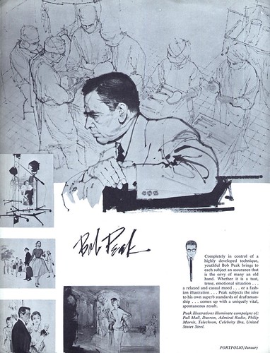
Bob Peak - "the envy of many an old hand"
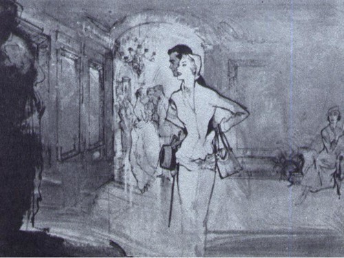
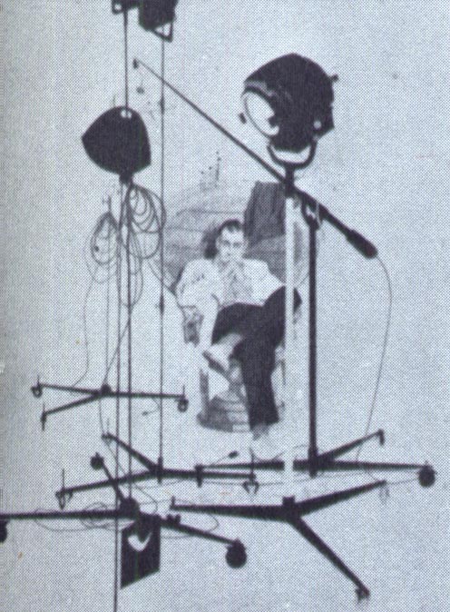
By the time the ad below appeared in a Fredman-Chaite Studio promo pamphlet in January 1954, Bob Peak's art had already graced campaigns for Pall Mall, Dacron, Admiral radio, Philip Morris, Telechron, Celebrity Bra and United Steel.
At that point the young artist, just 27 years old, had been in New York for less than one year.

In his article in Illustration magazine #6, Thomas Peak, the artist's son, writes about his father's determination to make it in 'the big time'. Peak had just married his art school sweetheart, Lucille Tedesco, in 1952. The two had met and fallen in love while they were both attending Art Center School in Los Angeles.

Barbara Bradley, who attended Art Center School in the years just before Peak, remembers, "One of our scholarship jobs at Art Center was to re-pack portfolios that had been submitted for acceptance. [I was] on duty when we packed one that was so outstanding, we took note of the name. Sure..it was Bob Peak’s. Even pre- Art Center, he packed everything into a piece. I still remember one about Hollywood or Hollywood Blvd... that was probably composite-like. And that became the Peak who so successfully did movie posters, packed with everything!"

But long before he would produce those well known iconic movie posters for Apocolypse Now, Roller Ball, Star Trek, Superman and so many other, this young Bob Peak was attempting to distinguish himself in the most competitive illustration market in America.

Tom Peak writes, "my dad spent three solid months assembling a sizeable portfolio of his work while my mother worked a full-time job to support them. He took the satchel with him when they left for New York City in 1953."
"Armed with little more than self-confidence and ambition when he arrived in New York, Bob was able to land a job at the [Fredman] Chaite Studios. Though he made very little money, he was working in the company of a number of other fine illustrators."

Its those early years of Bob Peak's career that most interest me, so this week let's look at the artist Fredman-Chaite described as the "youthful Bob Peak... envy of many an old hand."
* I have many people to thank for assisting me with this week's topic: Barbara Bradley, Charlie Allen, David Apatoff, Tom Watson for their advice, opinions, information and scans, and Dan Zimmer for allowing me to excerpt passages from Tom Peak's article in Illustration magazine, which are ©2003, 2008 by Tom Peak, Dan Zimmer and The Illustrated Press, Inc., and all artwork © The Estate of Robert Peak.
There is much, much more on the artist at Bob Peak.com
* This was Part One of a previously presented series on Bob Peak. If you'd like to read the entire series, here's Part 2, Part 3, Part 4, Part 5 and Part 6
My Bob Peak Flickr set.


0 comments:
Post a Comment