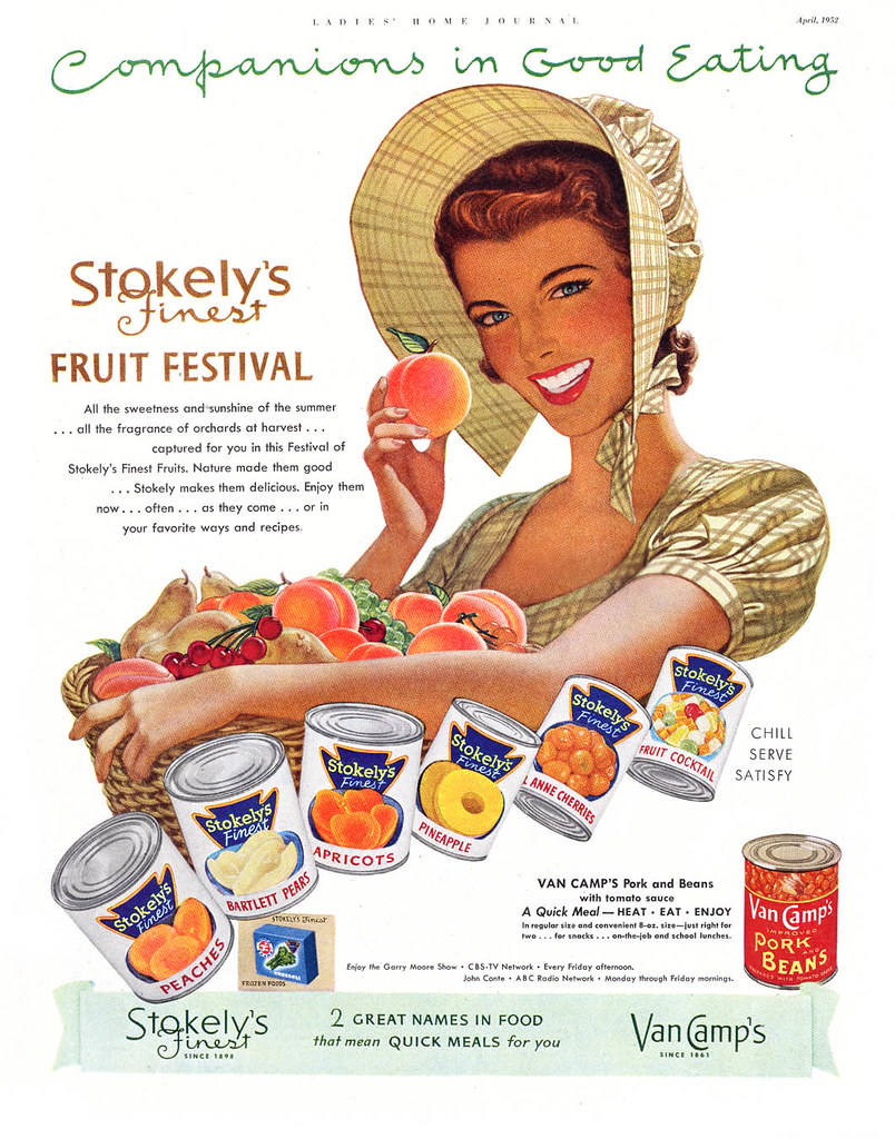
Those who regard advertising as crass and devoid of artistic merit should take a good look at these ads. This is realism, and it is idealized, but its a distinctly stylized version of the perfect world. Unlike the more typical Madison Avenue eye candy of that era, White's interpretation of his subjects was as personal as a fingerprint.
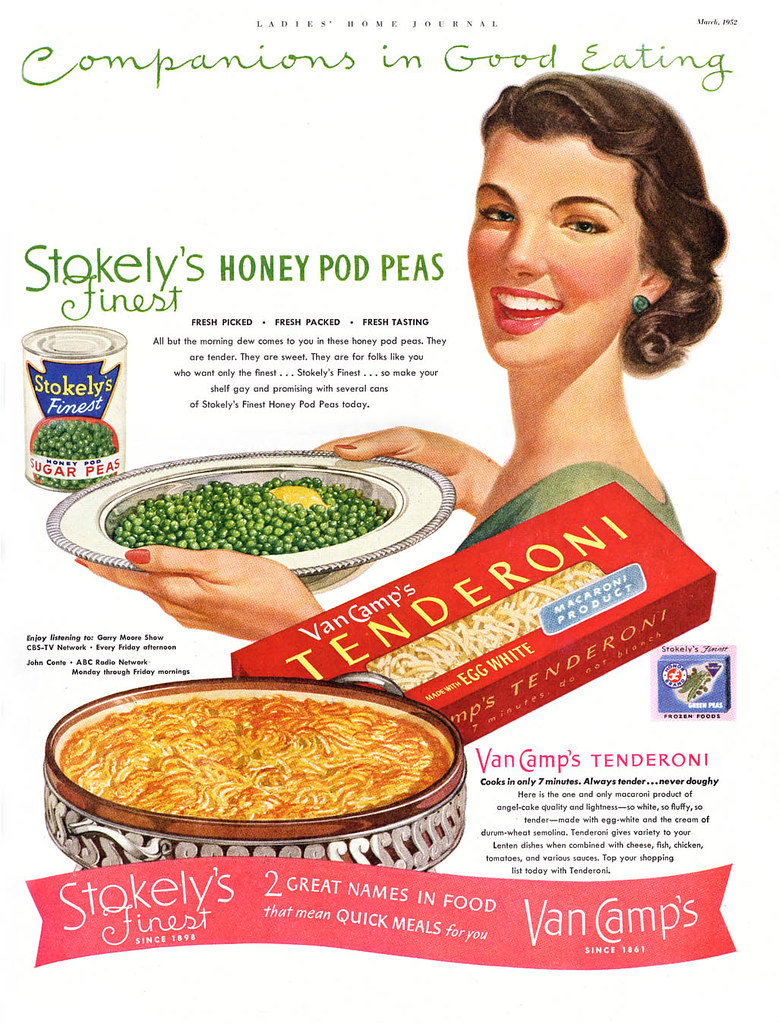
Now I hope Nat's daughter and grandson (who may end up reading this at some point) don't take offense at where I'm going with this - because I really do love the artist's work - but over the years, as I've collected these ads, I've been intrigued by the unusual look of what I presume was White's efforts to portray cuteness in kids.
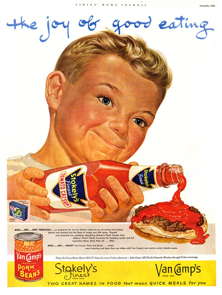
On occasion, as we see below, he pretty much hit the mark. This handsome little feller (though stylized in that very specific Nat White way) is the epitome of all-American boyish cuteness. Why I'll bet, after he finishes his burger, he's gonna go right out and throw a baseball or whittle a stick or something.
But then there's this kid, who is starting to look a little... odd...
And this guy... what's up with this guy? He looks like a 55 year old card shark who just swindled you out of your paycheque in Atlantic City.
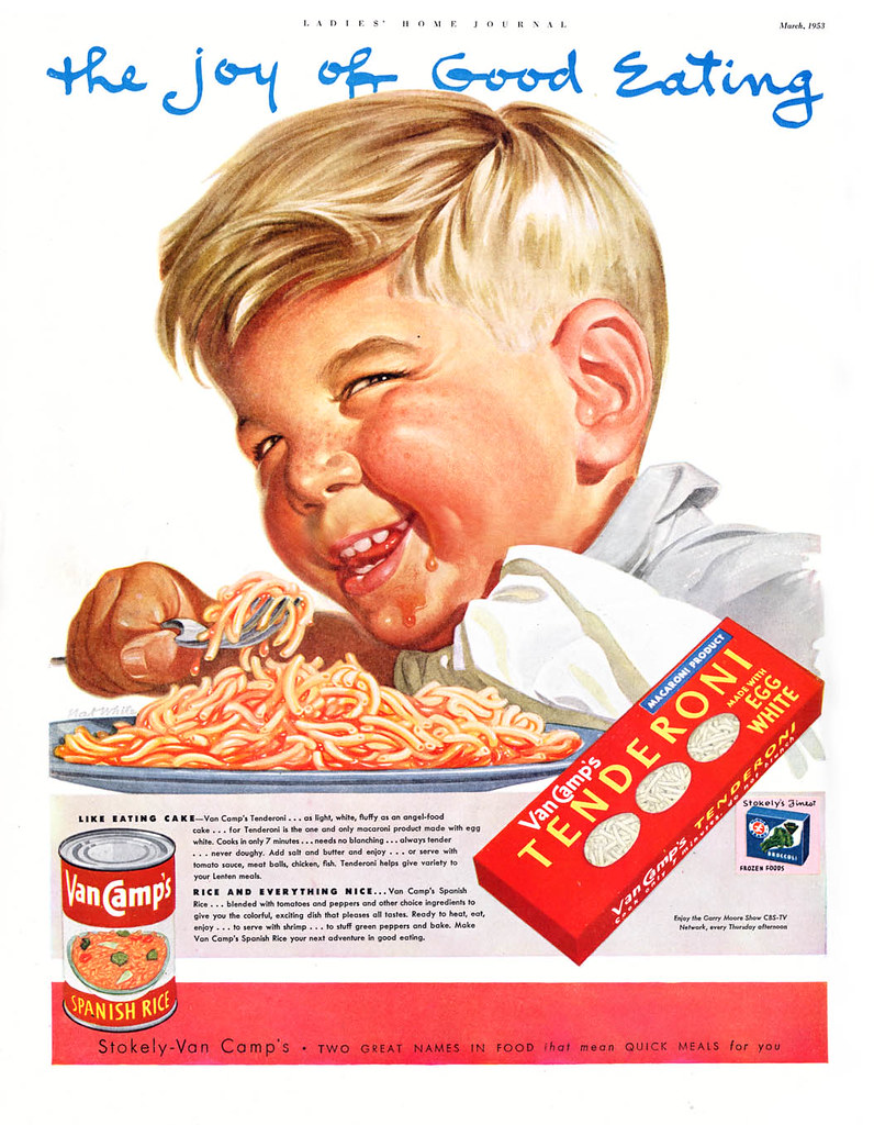
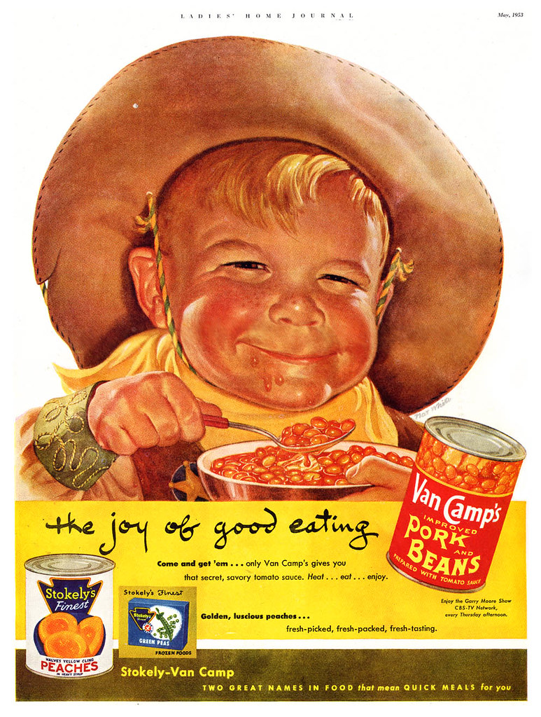
And this kid - yikes! I call him "Nat White's Bean Eating Demon Child."
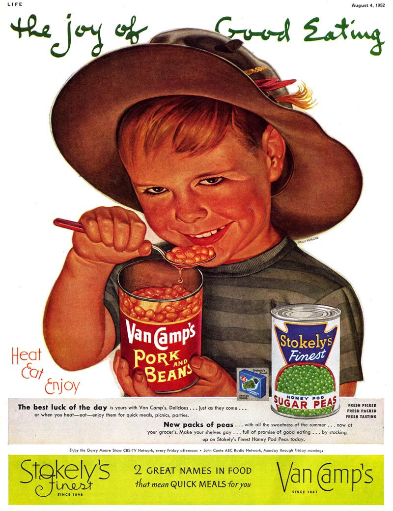
Just stare into those eyes for a minute and tell me you don't get the willies. And I didn't adjust the colours on this either - White actually painted Damien here with the glow of hellfire bottom-lighting his terrifying visage.

Again, I don't mean to disparage Nat White. I really do love his work. How he started out with the best of intentions and ended up painting pure evil will probably never be resolved. But the bigger mystery is...
... how the H-E-double-hockey-sticks did the art director, the ad agency and Stokely Van Camp all give their approval to print this scary artwork?!
* My Nat White Flickr set


0 comments:
Post a Comment